Visualice las tendencias geográficas con mapas
Transforme los datos con mapas vibrantes que facilitan la comparación de valores, la revelación de patrones regionales y el descubrimiento de información procesable.
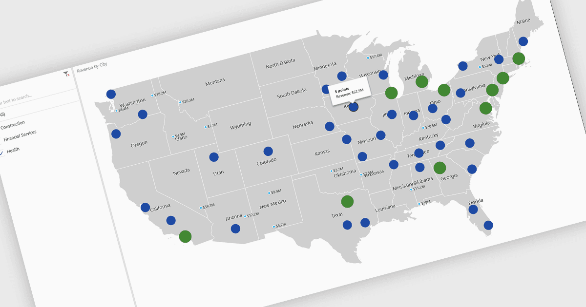
Un mapa es una representación visual de datos que muestra valores en regiones geográficas mediante colores, sombreado o marcadores, lo que facilita la interpretación de información compleja. Al colocar los datos en un contexto espacial, los mapas ayudan a los usuarios a identificar rápidamente patrones regionales, tendencias y valores atípicos que podrían pasar desapercibidos en tablas o gráficos tradicionales. Son especialmente útiles para comparar valores entre países, estados o condados, lo que permite obtener información más clara sobre datos distribuidos geográficamente. Los casos de uso más comunes incluyen ilustrar la densidad de población, destacar los resultados de las elecciones, analizar el rendimiento de ventas por región y presentar indicadores económicos. Los beneficios clave de los mapas incluyen su capacidad para simplificar conjuntos de datos complejos, ofrecer comparaciones intuitivas y respaldar la toma de decisiones basada en datos al conectar visualmente los números con ubicaciones del mundo real.
Varios controles de gráficos de .NET Core ofrecen mapas, incluidos:
- DevExpress WinForms Chart (parte de DevExpress WinForms) le permite visualizar datos geográficos con mapas personalizables, lo que facilita comparaciones regionales precisas.
- ComponentOne Charts for WinForms (parte de ComponentOne Studio WinForms by MESCIUS) le permite transformar conjuntos de datos espaciales en mapas interactivos.
- Telerik WPF Chart (parte de Telerik UI for WPF) facilita una narración geográfica potente a través de mapas, ayudando a los usuarios a revelar tendencias y explorar el rendimiento regional.
- Infragistics WPF Charts (parte de Infragistics Ultimate UI for WPF) le permite analizar los datos con contexto mediante mapas, combinando un diseño intuitivo y una visualización clara.
Para un análisis en profundidad de funciones y precio, visite nuestra comparación de controles de gráficos de .NET Core.