


Proveedor oficial
Como distribuidores oficiales y autorizados, le suministramos licencias legítimas directamente de más de 200 editores de software.
Ver todas nuestras marcas.
Continuar leyendo en inglés:
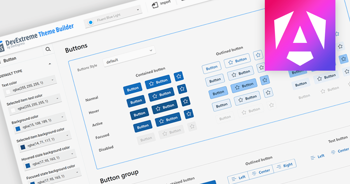
Theming support in UI component suites refers to the capability to define and apply consistent visual styles, such as colors, typography, spacing, and component appearances across an entire application. It typically allows developers to customize or switch themes dynamically, enabling alignment with branding requirements or user preferences without modifying core component logic. This separation of styling from functionality improves maintainability, reduces duplication, and accelerates development by promoting reuse, while also supporting scalability as design systems evolve and new themes are introduced.
Several Angular UI suites offer theming including:
For an in-depth analysis of features and price, visit our Angular UI suites comparison.
Tel: (888) 850 9911
Fax: +1 770 250 6199


