
Codejock Toolkit Pro
Proporciona a los desarrolladores de Visual C++ MFC un conjunto profesional de controles modernos.
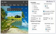
Controles - Proporciona a desarrolladores Windows varios componentes listos para usar, incluidos Buttons, Combo Box, Common Dialogs, Progress Bars, Edit Controls, Alert Popup Widows, Themed Scroll Bars, Tab Controls, etc.


 (3)
(3)
 (2)
(2)
 (5)
(5)


