Semplifica la selezione della data nelle applicazioni React
I componenti calendar estendono l'interfaccia utente offrendo agli utenti un modo intuitivo per navigare e gestire informazioni basate sulle date.
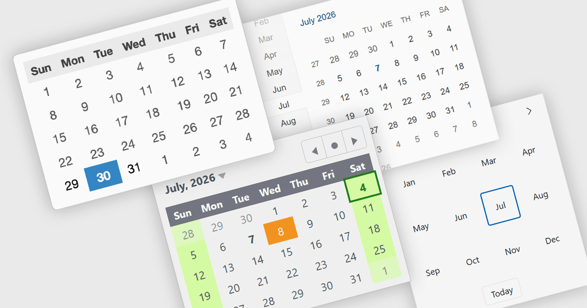
I componenti calendar sono controlli dell'interfaccia utente che visualizzano date e informazioni temporali in un formato strutturato e interattivo. Sono ampiamente utilizzati per la programmazione, la selezione della data, la gestione degli eventi, i sistemi di prenotazione e le applicazioni di pianificazione, fornendo agli utenti un modo intuitivo per interagire con dati basati sul calendario. Molti componenti calendar supportano la navigazione tra viste mensili, annuali e decennali, oltre alla localizzazione, alla navigazione tramite tastiera e alle opzioni di personalizzazione per adattarsi a diverse esigenze applicative. Presentando le date in un formato visivo familiare, migliorano l'usabilità, aiutano a ridurre gli errori di input, semplificano la navigazione attraverso i periodi temporali e possono offrire un'esperienza coerente su dispositivi desktop e mobili quando utilizzati in applicazioni responsive.
Diverse suite UI per React offrono controlli calendar, tra cui:
- DevExtreme Complete di DevExpress include un componente Calendar con selezione data singola, multipla e intervallo, livelli di zoom, localizzazione e personalizzazione.
- Wijmo di MESCIUS offre un controllo Calendar con modalità di selezione configurabili, localizzazione, navigazione da tastiera, restrizioni sugli intervalli di date e opzioni di personalizzazione.
- KendoReact di Telerik propone componenti Calendar e MultiViewCalendar con selezione date, selezione intervalli, viste configurabili, accessibilità e supporto alla globalizzazione.
- Syncfusion Essential Studio Enterprise dispone di un componente Calendar con selezione data singola e multipla, modalità di visualizzazione, globalizzazione, accessibilità e opzioni di personalizzazione.
Per un'analisi approfondita delle funzionalità e dei prezzi, visita il nostro confronto delle suite UI React.