New Release: ComponentOne Studio for WPF (Japanese Version)
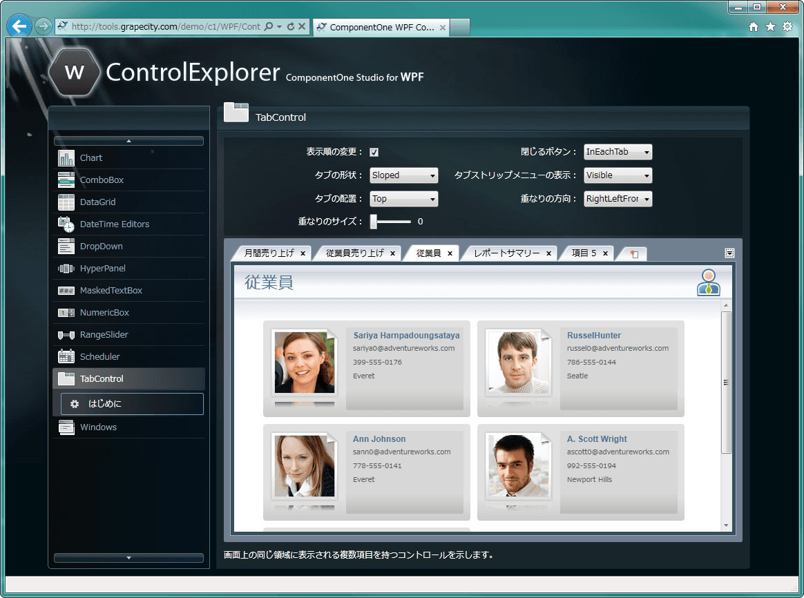
ComponentOne Studio for WPF(Japanese Version) ComponentOne Studio for WPF is a set of WPF component libraries that enables you to develop applications of all kinds in Visual Studio and Expression Blend. It includes components across a wide range of categories, such as grids, charts, reports, schedulers, and input assistance. This development style—selecting and using the right components from among a variety of options—allows you to flexibly handle a wide range of development projects. It also brings benefits such as skill improvement for personnel through continued use of the tools, as well as reduced running costs. The component suite is an ideal product if you are just starting WPF development or if you plan to use WPF for the long term going forward.
Main features of 2011J WPF
- Total support for WPF application development
- A component suite that covers all-around needsThe suite includes components in a broad range of categories that are essential for business systems, such as grids and charts, as well as container and input-assistance controls. It also provides attractive user-interface controls that capture users’ interest, such as a hyper panel that enlarges content in response to mouse operations.
- Development support featuresThe components included all come with a rich set of properties and methods. In addition, the suite is compatible with Expression Blend, allowing you to set various properties and animations intuitively and clearly. It strongly supports developers’ coding work and helps shorten development timelines.
- Excellent cost performanceThis is a set product that includes features that are difficult to achieve with standard offerings. It supports the development of business applications in all fields on the WPF platform. By reusing it across a variety of projects, you can expect to reduce development costs.
- Rich sample code includedIt includes many sample projects that introduce the basic behaviors of components, examples of how to use them, and advanced examples that combine multiple components. You can learn the fundamentals of using components in a short period of time, and you can also use them as reference materials for acquiring practical techniques.
- A wide range of functions to meet every need
- Grid With two types of data grids, it enables a variety of data representations. FlexGrid for WPF is the WPF version of the well-regarded FlexGrid from the ActiveX era. It provides an unbound mode in which the control itself stores and manages data, without using data binding. It also offers custom cells that allow any control to be used in both cell editing and display. DataGrid for WPF supports template customization, letting you fully take advantage of WPF’s design capabilities. Both data grids achieve UI virtualization in both the row and column directions, enabling smooth display even for data with many items and rows.
- Charts It supports more than 40 chart types, including bar charts, pie charts, candlestick charts, and radar charts. You can also overlay and display multiple charts. Features that match user operations are also充実, such as dynamic zooming/panning, scrolling, and tooltip display.
- Reports It adopts the same GUI designer as the report components included in ComponentOne Studio for Windows Forms. With the same way of working as before, you can design WPF reports. In addition, report definition files can be read as-is from those created for Windows Forms. It also includes export capabilities to a variety of formats—not only printing, but also HTML, PDF, XPS, and more. You can smoothly migrate to WPF while making effective use of your existing report assets.
- Schedules Create an Outlook-style scheduling management system without coding. It provides functionality for creating, editing, and deleting appointments. You can switch the views of the schedule to four types: “monthly,” “weekly,” “daily,” and “workday-based.” Each view includes navigation such as switching between months and dates. By using a calendar control, you can display multiple months and select dates spanning multiple months.
- Containers It includes a window component that can display another window within WPF content, tabs that support scroll display and menu display, and a hyper panel that enlarges content according to mouse movement.
- Input assistance It provides controls that support input such as numbers, masked text, dates, and times, as well as combo boxes that support text input and changing the dropdown size. With the slider control, you can specify two thumbs. Because it can retrieve the range specified by those two points, it can be used for tasks such as trimming videos.
About GrapeCity
GrapeCity “Grape,” with the symbols of “life,” “connections,” and “bounty,” and “City” represents an invisible, enormous “information brain city” that exists in the information space, while “Cluster” represents the connections between every staff member across the world.
Our global, real-time information network is the source of the power behind GrapeCity. With Japan as its headquarter, networks spread across China, India, Vietnam, the United States, and Mongolia work in close collaboration. With the completion of the core headquarters building in Sendai, the ability to communicate among cluster companies and staff members has been further strengthened. Leveraging that collaboration, GrapeCity will continue to provide high-quality product development and services.