FlexGrid for WPF(Japanese version)is now on sale
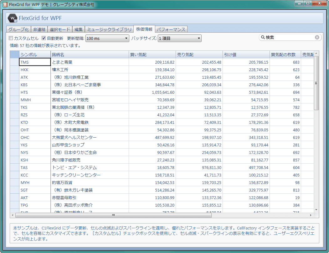
FlexGrid for WPF(日本語版) FlexGrid for WPF is a WPF data grid component that lets you display and edit linked and unlinked data in a tabular format. With an unbound mode that allows you to manage data inside the control without binding it to a data source, it inherits many of the features found in FlexGrid for Windows Forms, such as multiple-row and multiple-column headers, fixed columns and fixed rows, and automatic adjustment of row/column ordering and sizing. It also provides solid support for the core functions required for a grid control. Another attractive feature is how easily you can set appearance options—such as the text and background colors of rows, columns, and headers—via properties without needing to be mindful of XAML. It also includes custom merges that let you merge any cell range, and custom cells that allow you to use different other control functionalities for cells during editing and for cells during display, enabling flexible cell layouts and user-friendly data entry. With its concept of “simple and easy to use” dating back to the ActiveX era, FlexGrid strongly supports the development of grid screens in WPF applications as well.
Main features of 1.0J
Features / Highlights
Unbound mode
You can use an unbound mode in which the control itself stores and manages the data. This makes it easy to display and control data through coding, and enables data-table representations with freely designed cell layouts, just like an Excel worksheet. You can also represent data by field units by binding it to a data source, similar to a standard data grid.
Cell merging
You can combine two or more cells and treat them as a single cell. This feature offers two types: “auto-merge,” which automatically merges cells when adjacent cells have the same value, and “custom merge,” which lets you freely merge any cell range.
Multiple-row / multiple-column headers
It supports both multi-row headers and multi-column headers. Since merging is also possible for these headers, you can create grids with highly visible, easy-to-understand layouts.
Fixed rows and fixed columns
You can fix an arbitrary number of rows or columns starting from the beginning as fixed rows and fixed columns, so they won’t scroll. You can also change the color of the dividing lines that indicate the boundary between the fixed region and the scrollable region.
Moving and resizing rows / columns
You can change the order of rows or columns via mouse drag operations. It also includes a feature that automatically adjusts row heights and column widths to match the displayed data.
Multiple selection modes
There are five ways to select cells: a single cell, a cell range, a single row, multiple rows, and list box mode. You can also configure whether to show or hide the lines that outline the selection range, and set the background color of the selected cells.
Data aggregation
Rows containing the same data can be grouped and displayed in an outline-tree format. In that process, it’s possible to automatically aggregate the data for each group and display totals, averages, and the number of data items in the group header row.
Cell editing features
For cell editing, you can use three prebuilt types of editors. The basic text type, a checkbox type, and a combo box type that includes auto-complete and data map functionality. The data map is a feature that can internally hold key values for each item in the combo box list, separately from the values used for display.
Custom cells
In addition to the built-in editors, there is also a way to assign functionality from any control. For example, you can use the C1MaskedTextBox control from ComponentOne Studio for WPF to perform input validation, or use the spin buttons of the C1NumericBox control to enter numeric values. Furthermore, custom cells can apply different control functionalities to two situations: the cell during editing and the cell during display.
Printing
It includes a printing feature that splits and adjusts the output when the grid doesn’t fit within a single page. It can also scale the grid to fit within one page for display. In addition, you can repeat row/column headers on each page and add a page header/page footer.
File input/output
Supports input/output in CSV (comma-separated) format, TSV (tab-separated) format, and HTML format files.
Compatibility with FlexGrid for Silverlight
FlexGrid for WPF preserves the same functionality as FlexGrid for Silverlight and is compatible at the source-code level. Therefore, if development is required in both environments, you can reuse the code created with one FlexGrid in the other, enabling smoother development.
About GrapeCity
GrapeCity “grape” represents the symbols of “life,” “connection,” and “abundance,”
“city” represents an invisible, massive “information intelligence city” that exists in the information space, and “cluster” represents the connections among each and every staff member spread across the world. A global, real-time information network is the source of the power of GrapeCity. Japan serves as the headquarter, and a network located throughout China, India, Vietnam, the United States, and Mongolia works in close coordination. With the completion of the core Sendai headquarters building, communication capabilities among the cluster companies and the staff have grown even stronger. Leveraging that collaboration, GrapeCity will continue to provide high-quality product development and services.