Streamline Data Entry and User Workflows
Checked listboxes improve user experience for tasks such as filtering, assigning permissions, or choosing multiple items from lists.
May 3, 2024Feature Highlight
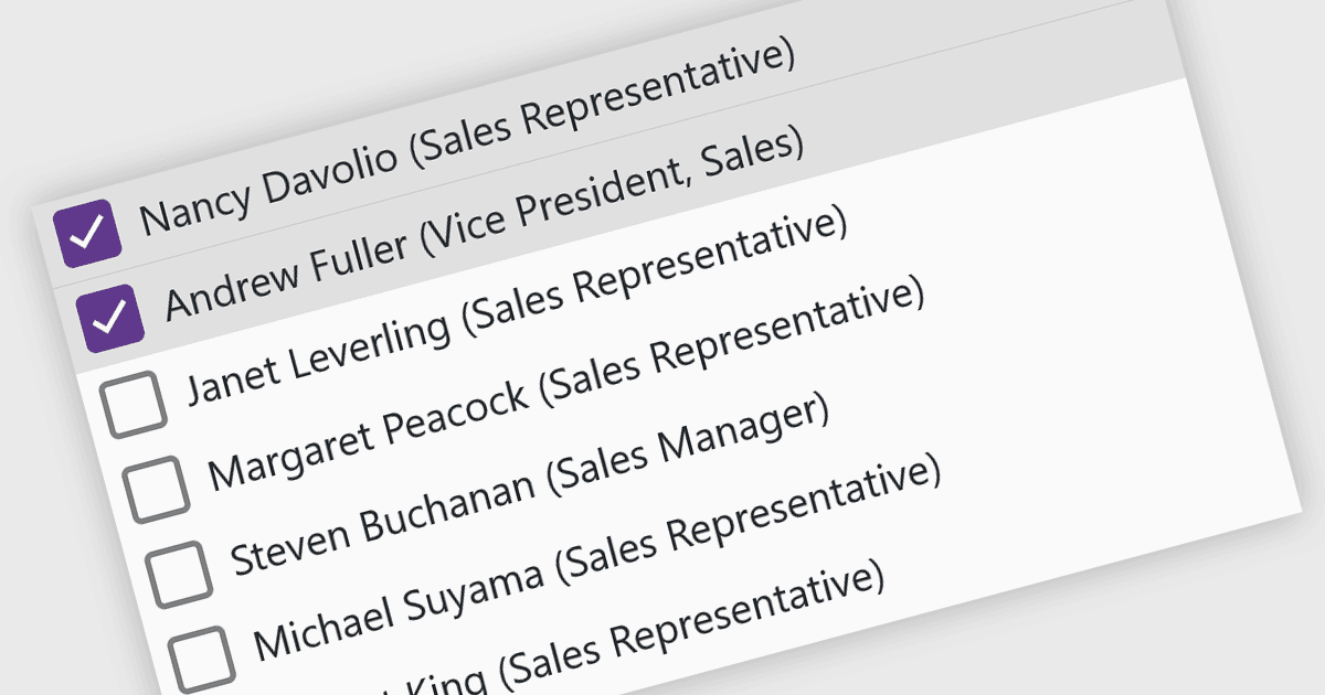
A checked listbox is a graphical user interface element that combines a listbox with checkboxes. It presents a list of options, similar to a standard listbox, but allows users to select multiple items by clicking on an adjacent checkbox for each option. This is useful for scenarios where users need to choose from various choices, but not be limited to a single selection.
Several Blazor data editor collections offer checked listboxes including:
- DevExpress Blazor Data Editors (Part of DevExpress ASP.NET and Blazor) empowers you to create Blazor checked listboxes with customizable appearance and data binding.
- ComponentOne Blazor Edition Input and Editors (part of ComponentOne Studio Blazor Edition by MESCIUS) furnishes Blazor applications with feature-rich checked listboxes.
- jQWidgets Blazor Data Editors equips your Blazor projects with versatile checked listboxes that streamline user selection of multiple choices.
- Syncfusion Essential Studio for Blazor Data Editors (part of Syncfusion Essential Studio Enterprise) offers extensive checked listbox options for enhanced user interaction.
For an in-depth analysis of features and price, visit our Blazor Data Editors comparison.