Empower Users to Explore Trends with Pivot Charts
Combine categories, metrics, and time-based trends into a single chart that simplifies complex data analysis and reveals actionable insights.
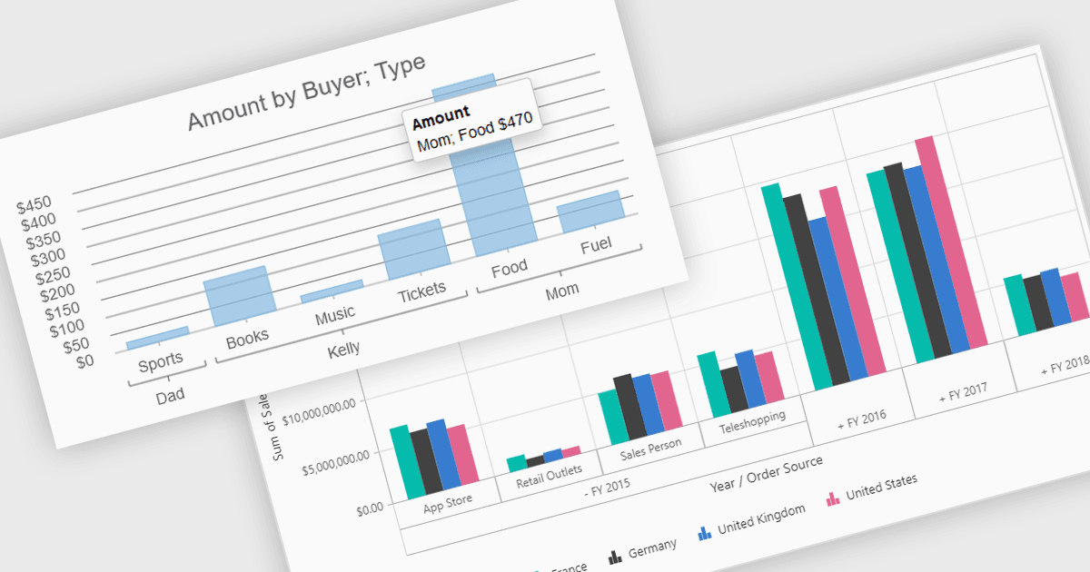
Pivot charts are dynamic visualization tools that enable users to interact with and analyze data in a highly flexible manner. They extend the capabilities of pivot tables by providing visual representations of aggregated data, making it easier to identify trends, patterns, and outliers. Key benefits include real-time updates, intuitive interactivity, and support for multi-dimensional data analysis, which simplifies complex datasets into actionable insights. Integrating pivot charts into your applications empowers end-users to explore and present data in a way that is both visually compelling and deeply informative.
Several React UI suites offer pivot chart components including:
- Wijmo by MESCIUS lets you create dynamic and responsive pivot charts, enabling seamless data analysis and visualization for modern web applications.
- Kendo UI by Telerik empowers you to build customizable pivot charts with real-time interactivity and comprehensive data aggregation tools.
- Syncfusion Essential Studio Enterprise provides advanced pivot charting features, ideal for exploring multidimensional data and uncovering actionable insights effortlessly.
- SmartClient by Isomorphic Software facilitates the creation of powerful pivot charts, offering robust tools for visualizing complex datasets within enterprise-grade applications.
For an in-depth analysis of features and price, visit our comparison of React UI Suites.