


Official Supplier
As official and authorized distributors, we supply you with legitimate licenses directly from 200+ software publishers.
See all our Brands.
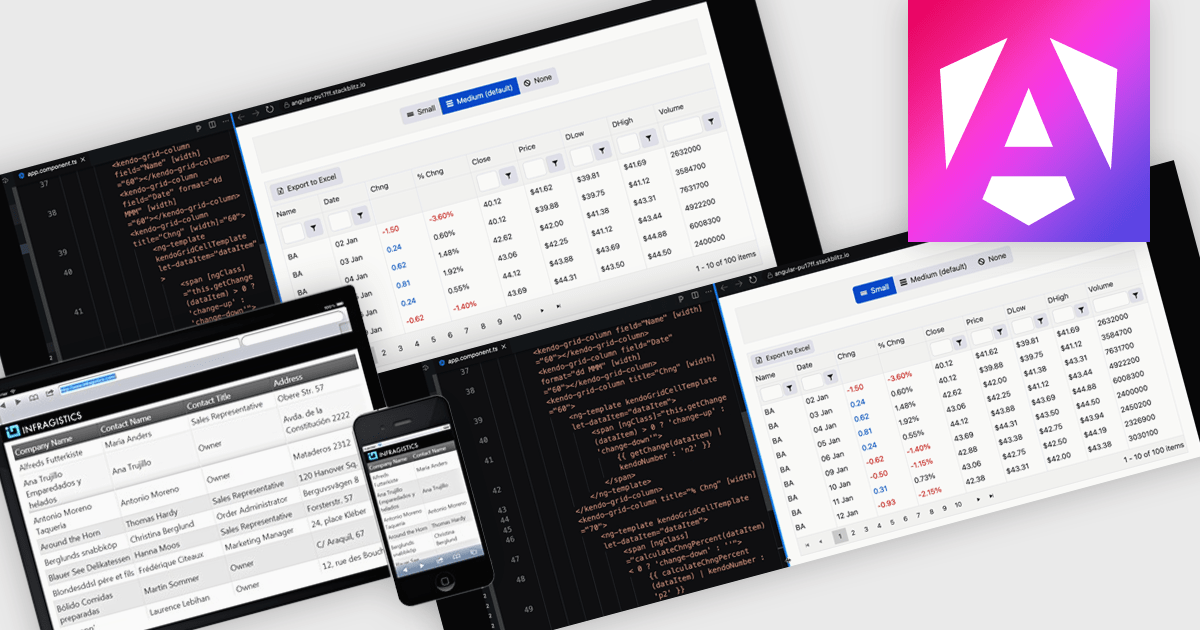
A responsive layout is a design approach that enables web and application interfaces to automatically adjust and optimize their structure, content, and elements for different screen sizes and devices. By using flexible grids, scalable images, and adaptable components, responsive layouts ensure a consistent and user-friendly experience across desktops, tablets, and mobile devices. For software developers, this approach simplifies the creation of cross-platform applications, improves accessibility, and enhances user satisfaction by delivering interfaces that perform seamlessly in diverse environments.
Several Angular grid components support responsive layouts including:
For an in-depth analysis of features and price, visit our comparison of Angular grid controls.


Tel: (888) 850 9911
Fax: +1 770 250 6199


