Illustrate Market Trends with Visual Precision
JavaScript chart controls with Kagi charts cut noise, highlight breakouts, and reveal supply and demand trends in market dynamics.
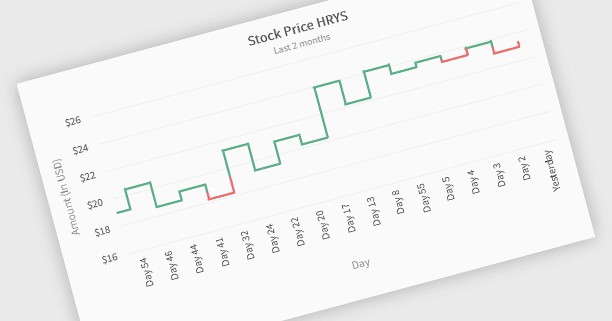
Kagi charts are a technical analysis tool that display price movement through vertical lines, ignoring time to focus on significant price changes. Thick lines indicate rising demand when prices break above previous highs, while thin lines signal increased supply when prices fall below previous lows. This clear visual format helps traders filter out noise, identify trends, and spot key breakouts or reversals. Ideal for analyzing market sentiment, Kagi charts are used across stocks, forex, and commodities to support confident, data-driven trading decisions.
Several JavaScript chart components provide Kagi charts, including:
- Wijmo FlexChart (part of Wijmo by MESCIUS) allows you to interpret price dynamics using Kagi charts, filtering noise to reveal clearer trading signals and sentiment.
- FusionCharts Suite XT enables Kagi chart rendering to highlight price breakouts and reversals, enhancing clarity in trend-based market visualizations.
- LightningChart JS Trader lets you visualize supply and demand shifts with Kagi charts for high-performance, real-time financial data analysis.
For an in-depth analysis of features and price, visit our JavaScript charts comparison.