


Official Supplier
As official and authorized distributors, we supply you with legitimate licenses directly from 200+ software publishers.
See all our Brands.
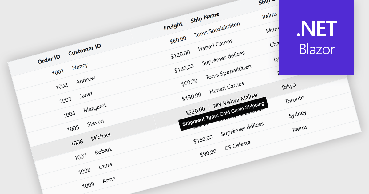
Tooltips in grid components provide contextual information that appears when users hover over or focus on a cell, column header, or row. It offers a practical way to surface additional details such as full text for truncated values, validation messages, or explanatory metadata without overcrowding the grid layout. For data-heavy interfaces, this feature improves readability and usability by keeping the primary view concise while still making secondary information readily accessible when needed.
Several Blazor grid controls offer FEATURE including:
For an in-depth analysis of features and price, visit our Blazor grid controls comparison.


Tel: (888) 850 9911
Fax: +1 770 250 6199


