Switch Between States with Toggle Controls
.NET data editors with toggle switch controls present clear on/off choices for forms and settings interfaces, improving usability and visual feedback.
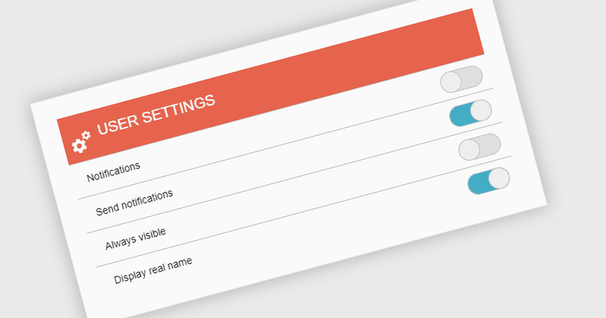
A toggle switch is a user interface control that allows users to quickly switch between two states, typically on and off. It provides a clear visual indication of the current state and enables immediate changes with a single interaction. Toggle switches are widely used in forms, settings panels, and configuration interfaces because they present binary choices in a compact and easily understandable format. Their visual clarity helps reduce user errors, while their interactive design supports efficient input and consistent behavior across desktop and mobile applications.
Several .NET data editor collections give you toggle switch functionality, including:
- DevExpress ASP.NET MVC Data Editors (part of DevExpress ASP.NET and Blazor) includes a toggle switch editor with customizable labels and MVC model binding support.
- ComponentOne .NET MAUI Input Controls (part of ComponentOne WinUI and MAUI Edition by MESCIUS) provides toggle switch functionality for selecting boolean values.
- Telerik UI for ASP.NET AJAX Data Editors (part of Telerik UI for ASP.NET AJAX) offers a toggle switch control with configurable states and client-side events.
- Infragistics Ignite UI for Blazor Data Editors (part of Infragistics Ignite UI) provides a Switch component with toggle behavior and two-way data binding.
For an in-depth analysis of features and price, visit our comparison of .NET data editor collections.