Build Interactive Pie Charts in Vue.js Apps
Visualize category proportions with responsive pie charts featuring tooltips, legends, labels, and animation.
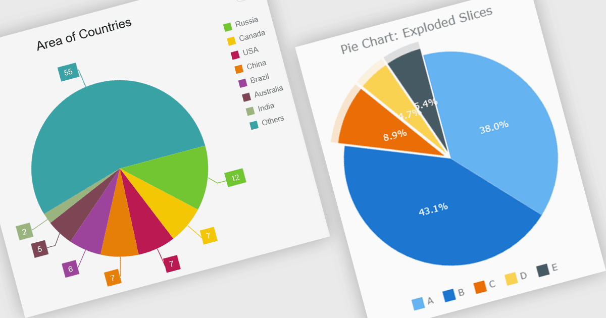
A pie chart enables developers to display data as proportional slices of a circle, with each slice representing a category's share of a single total. It is well suited to datasets that show part-to-whole relationships, making it easy for users to compare relative proportions at a glance. A well-designed implementation typically includes interactive features such as tooltips, legends, labels, animations, responsive layouts, and customization options, allowing the chart to integrate cleanly into modern web applications while providing a clear and accessible way to present composition data.
Several Vue.js chart components support pie charts, including:
- Highcharts Core lets you create interactive pie charts with rich customization, responsive layouts, animations, tooltips, legends, and flexible styling options.
- DevExtreme Vue Chart (part of DevExtreme Complete by DevExpress) allows you to build responsive pie charts featuring customizable slices, labels, legends and animations.
- Kendo UI Vue Charts (part of Kendo UI by Telerik) facilitates creating charts with configurable labels, legends, tooltips, styling, and responsive rendering.
- AnyChart JS lets you develop customizable pie charts with interactive tooltips, configurable labels, exploded slices, responsive layouts, and extensive appearance options.
For an in-depth analysis of features and price, visit our comparison of Vue.js charting components.