Analyze Data Trends Over Time
Visualize underlying patterns with chart trendlines to clarify data direction, reduce the impact of fluctuations, and support informed decision-making.
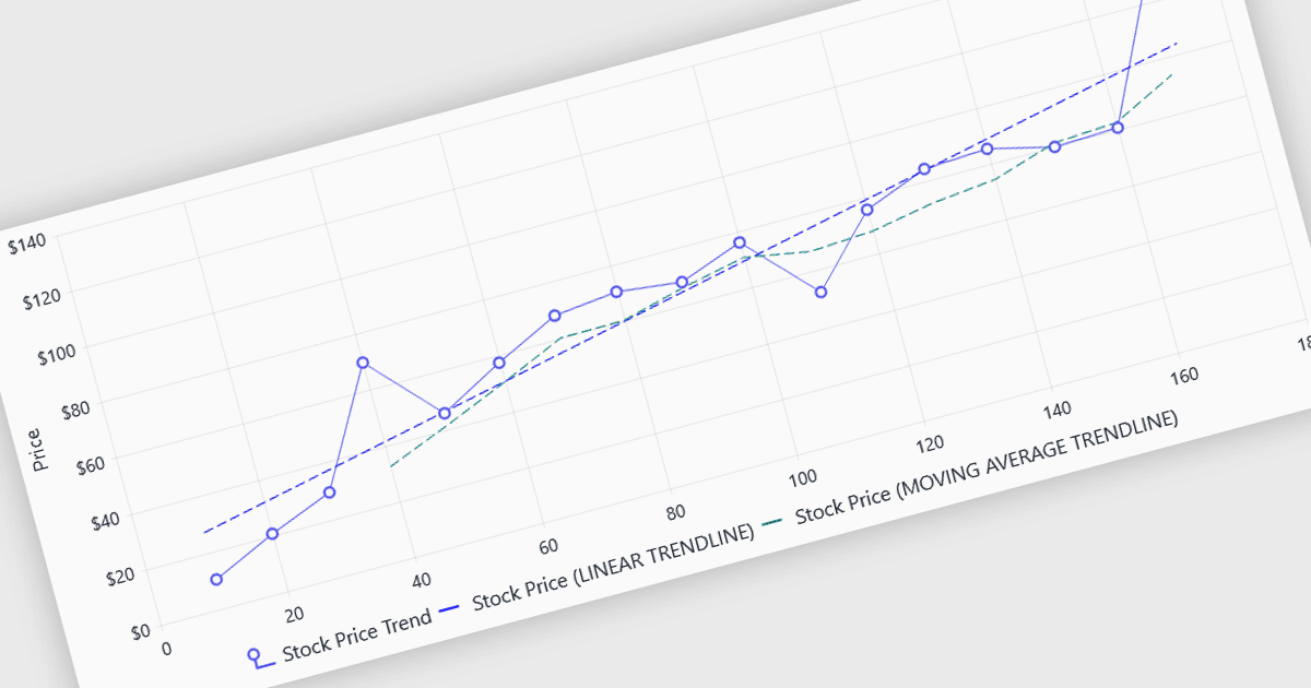
Trendlines in charts provide a visual representation of the general direction or pattern within a dataset, helping users understand how values change and develop over time. By reducing the emphasis on individual fluctuations, they make broader patterns, relationships, and potential changes easier to identify and interpret. Trendlines can support forecasting, comparison, and data-driven decision-making, and are particularly useful for analyzing sales performance, financial results, customer activity, operational metrics, scientific data, and other datasets where understanding overall direction is important.
Several Blazor chart components provide trendline support including:
- Telerik UI Blazor Chart lets you add trendlines to visualize data direction, identify patterns, and support clearer analysis within Blazor applications.
- ComponentOne Blazor Charts by MESCIUS enables trendline visualization to clarify overall data direction, reduce emphasis on fluctuations, and improve analytical insights.
- Infragistics Ignite UI for Blazor Chart lets you add trendlines to highlight data patterns, visualize direction, and support more effective analysis.
- Syncfusion Blazor Charts facilitates trend analysis by displaying trendlines that highlight patterns, support forecasting, and make complex chart data easier to interpret.
For an in-depth analysis of features and price, visit our Blazor Chart Component comparison.