Style Angular Grids with Built-in Themes
Apply predefined grid styles to match your Angular app and reduce custom CSS.
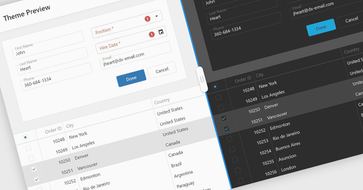
Built-in themes in Angular grid components provide ready-made styles for headers, cells, borders, selection states and other interface elements. Developers can apply a consistent appearance without styling each element individually, reducing CSS work and simplifying maintenance. Theme options such as Material, Bootstrap and Fluent help grids fit an application's existing design, while light and dark variants support different viewing preferences.
Several Angular grid components offer built-in themes, including:
- DevExtreme Angular Data Grid by DevExpress lets you apply Generic, Material and Fluent themes, with predefined colors, light and dark styles, and compact variants.
- Highcharts Grid Pro provides a built-in default theme with light and dark styling support, alongside CSS variables for customizing grid colors, typography, borders and interactive elements.
- Kendo UI Angular Grid by Telerik allows you to use supplied Default, Bootstrap, Material and Fluent themes through theme packages and stylesheets.
- Wijmo Angular DataGrid (FlexGrid) by MESCIUS provides predefined CSS themes for styling headers, cells, borders and selection states, with Sass-based customization for creating application-specific designs.
- Handsontable by Handsoncode provides built-in Main, Horizon and Classic themes, each with light and dark modes, alongside CSS variables and a Theme API for customizing grid appearance.
For an in-depth analysis of features and price, visit our Angular grid controls comparison.