Add Configurable Buttons to React Forms
Give users clear controls for submitting data, opening dialogs, and running application commands with customizable React button editors.
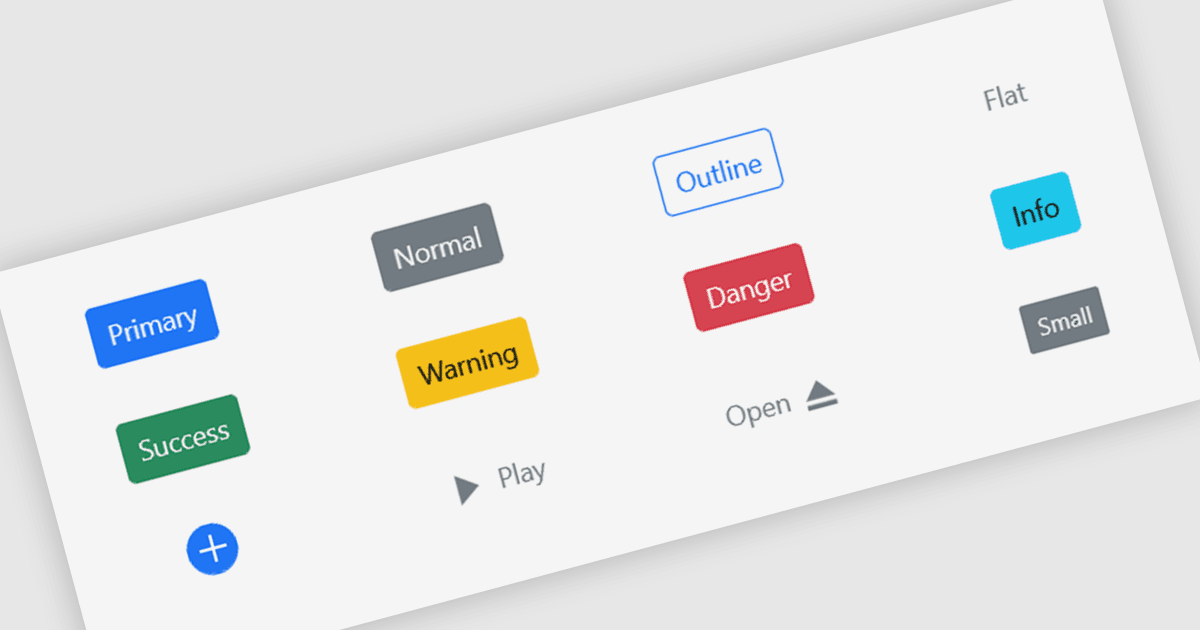
Button editors provide clickable controls that connect user actions to application logic. In React forms, they can submit entries, reset values, or run commands through event handlers. Configurable text, icons, styles, and disabled states help developers distinguish primary actions from secondary options and show when a command is available. Reusable button components also help maintain consistent appearance and behavior across forms and screens.
Several React Data Editing controls include button functionality:
- KendoReact Data Editors by Telerik include buttons with text, icons, images, and toggle behavior, allowing developers to configure commands and selection states.
- DevExtreme React Data Editors by DevExpress provide predefined button color schemes and contained, outlined, and text styles, with icon support for identifying actions.
- Syncfusion React Data Editors offer predefined button styles, icon positioning, and disabled states, with support for implementing toggle and repeat actions.
- Infragistics Ignite UI for React Data Editors include contained, outlined, flat, and floating action buttons, with prefix and suffix content for adding icons or other elements.
For an in-depth analysis of features and price, visit our comparison of React Data Editing controls.