在 Blazor 中有效可视化比例数据

4月 18, 2024
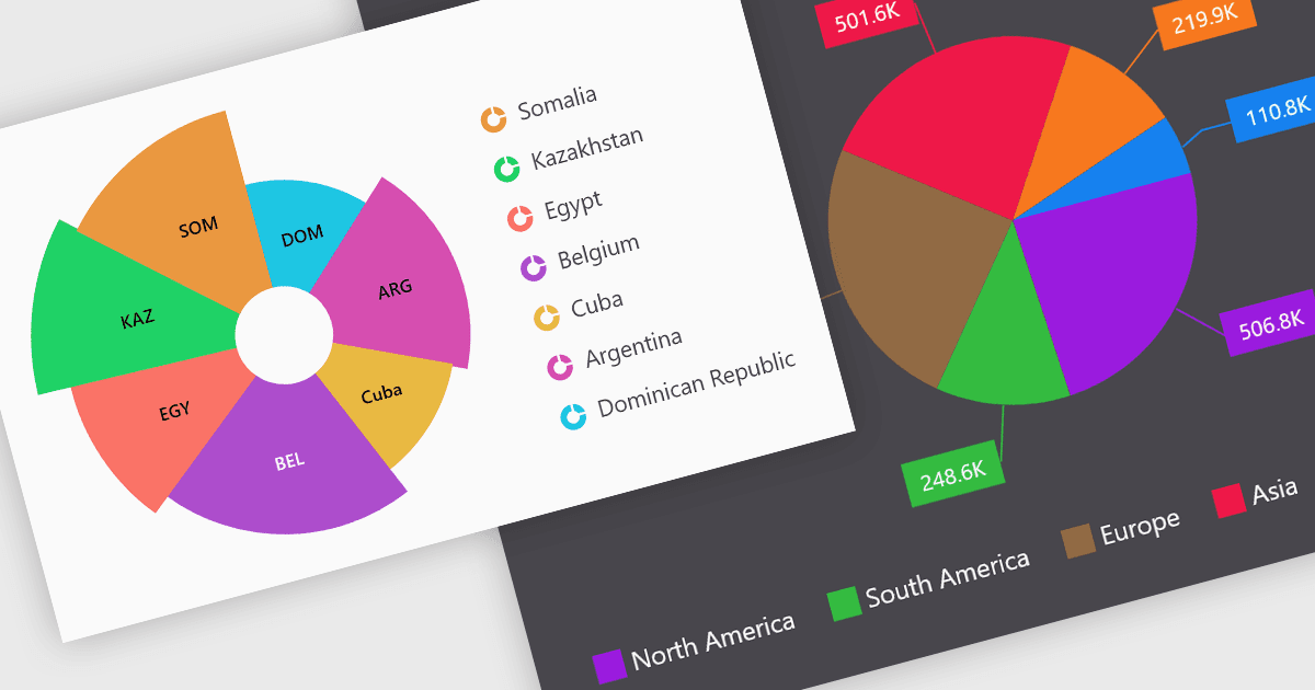
饼图允许用户查看数据集中不同类别的相对大小,从而提供数据集及其组成部分的清晰视图。

继续用英语阅读:

Pie charts are a useful and easily understood tool for visualizing data breakdowns at a glance, particularly when representing percentages of a whole. Their strength lies in highlighting the relative proportions between a small number of categories within a dataset. While less effective for complex comparisons or trends over time, pie charts can be an effective choice to communicate compositions and dominance within a dataset.

Several Blazor Chart controls offer Pie charts including:

  • DevExpress Blazor Chart (Part of DevExpress ASP.NET and Blazor) empowers you to create informative pie charts with customization options for clarity.
  • ComponentOne Charts for Blazor (part of ComponentOne Studio Blazor Edition by MESCIUS) offers visually striking pie charts to effectively communicate data proportions.
  • Telerik Blazor Chart (part of Telerik UI for Blazor) facilitates clear and interactive pie charts, enabling viewers to grasp data relationships.
  • Syncfusion Blazor Chart (part of Syncfusion Essential Studio Enterprise) allows you to design compelling pie charts that effectively showcase data breakdowns.
  • Infragistics Blazor Charts (part of Infragistics Ignite UI) empowers you to create user-friendly pie charts, making complex data easily digestible.

For an in-depth analysis of features and price, visit our Blazor Chart controls comparison.

Compare Blazor Chart Controls