通过响应式布局提升用户体验
设计优先考虑包容性与可用性的界面,确保在任何设备上都能实现一致的用户体验与顺畅导航。
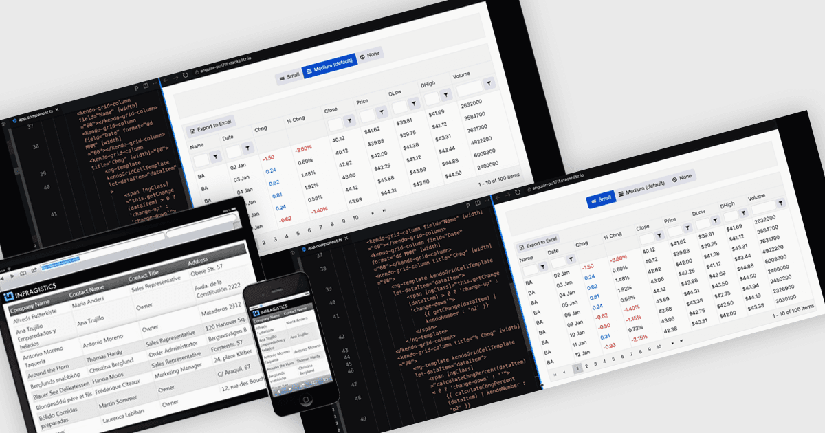
响应式布局是一种设计方法,能够让网页和应用界面根据不同的屏幕尺寸与设备自动调整并优化其结构、内容和元素。通过使用灵活的网格、可伸缩的图像以及可适应的组件,响应式布局可确保在台式机、平板电脑和移动设备上提供一致且友好的用户体验。对软件开发者而言,这种方法简化了跨平台应用的创建,提升了可访问性,并通过让界面在多样环境中实现无缝运行来增强用户满意度。
一些 Angular 网格组件支持响应式布局,包括:
- IntegralUI Grid(Lidor Systems 的 IntegralUI Web 组成部分)让你能够创建带响应式布局的可定制数据网格,确保在各种设备上都能实现无缝性能。
- Handsontable(Handsoncode)通过类似 Excel 的响应式网格,帮助你以直观的方式管理数据;该网格会根据不同屏幕尺寸动态适配,以实现最大的易用性。
- Kendo UI for Angular Grid(Kendo UI,Telerik 的产品)赋能开发者构建具备强大数据处理能力且在不同设备与分辨率下保持一致性的网格。
- DevExtreme HTML5 JavaScript Data Grid(DevExpress 的 DevExtreme Complete 组成部分)支持响应式数据展示,将自适应布局与高级编辑功能相结合。
如需深入了解功能与价格,请访问我们对 Angular 网格控件的对比。