


官方供应商
我们作为官方授权经销商,直接提供超过200家开发厂家所发行超过1000个的产品授权给您。
查看我们的所有品牌。
继续用英语阅读:
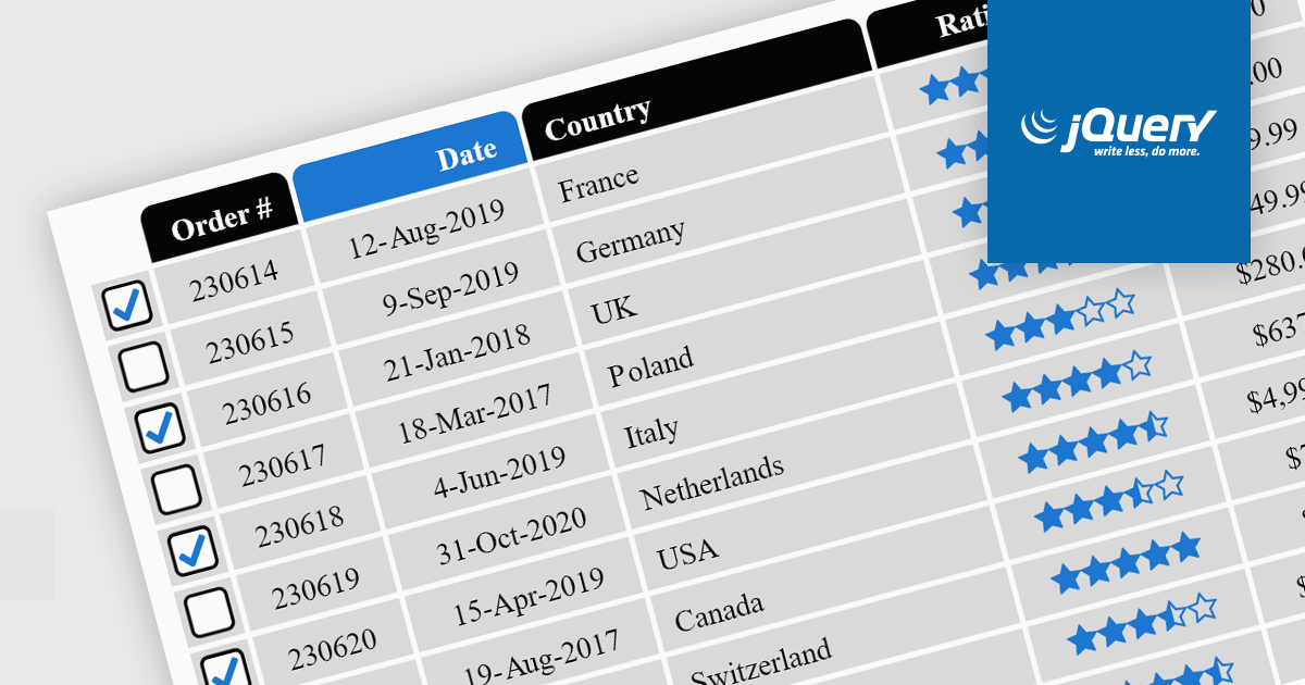
Cell types in Grid components are specialized configurations that define how data is displayed, edited, and interacted with within a grid or table structure. They allow developers to tailor the presentation and functionality of each cell to better match the type of data it contains. By specifying cell types such as text, numeric, date/time, and more, Grid components can provide intuitive controls and formatting automatically, streamlining data entry and reducing errors.
Common features include:
For an in-depth analysis of features and price, visit our jQuery grid components comparison.
联系电话: (888) 850 9911
传真: +1 770 250 6199


