用结构化选项卡视图组织数据报表

5月 13, 2025
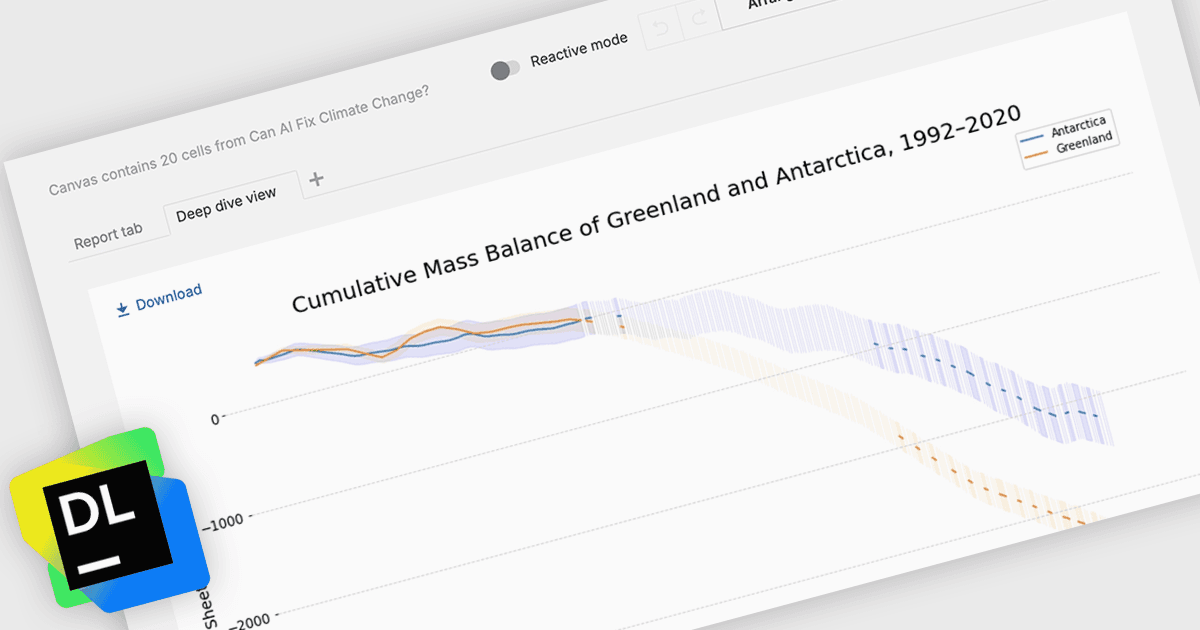
Datalore 2025.2 添加新的选项卡式界面,其通过将内容分组为清晰的部分可以更轻松地导航复杂的报表。

继续用英语阅读:

JetBrains Datalore is a collaborative data science platform that streamlines data exploration, analysis, and visualization through Jupyter-compatible notebooks. It empowers teams with features like automatic visualizations, pre-configured environments, interactive controls, and seamless collaboration functionalities. Datalore offers both cloud-based and self-hosted deployment options, catering to both individual and team-based data science workflows.

The Datalore 2025.2 update adds a new Report Tabs feature which enhances the way users structure and present their analytical content. Much like sheets in Microsoft Excel or pages in Power BI, these tabs enable authors to divide a single report into multiple, logically grouped views. Each tab can contain selected cells and outputs, with every element appearing in only one tab to maintain clarity. This structure supports better organization of data narratives and ensures that report viewers can easily navigate through different segments of the report without being overwhelmed. It is a significant improvement for teams who need to present multifaceted analyses in a clean, digestible format.

To see a full list of what's new in version 2025.2, see our release notes.

Datalore is licensed per user, and is available as a commercial annual subscription license. See our Datalore licensing page for full details.

For more information, visit our Datalore product page.