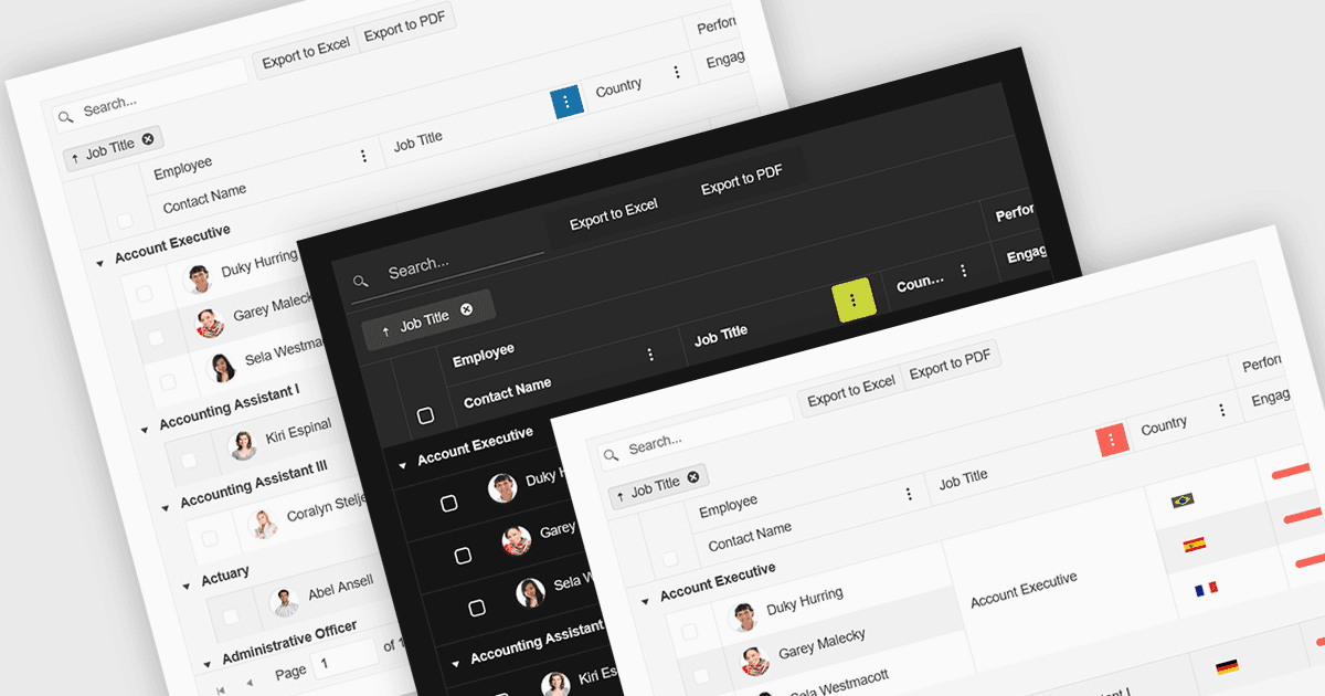
在您的数据网格中即时切换主题

9月 16, 2025
对主题的内置支持让您能够快速将您网格的外观与应用程序设计标准保持一致。

继续用英语阅读:

Built-in theme support in a React grid refers to the component's ability to natively integrate and adapt to predefined visual styles without requiring extensive custom CSS. This feature allows developers to quickly apply consistent, professional-looking designs that align with widely used UI frameworks such as Material UI, Bootstrap, or custom enterprise branding. It simplifies the process of maintaining visual consistency across applications, reduces front-end development time, and ensures that the grid remains visually coherent with the rest of the user interface, particularly during updates or when switching between themes.

Several React Grid controls offer support for built-in themes including:

  • KendoReact Data Grid (part of KendoReact by Telerik) lets you choose among built‑in themes like Default, Bootstrap, Material, Fluent, and Classic, plus color swatches via SCSS variables.
  • DevExtreme HTML5 JavaScript Data Grid (part of DevExtreme Complete) allows usage of predefined themes such as Generic, Material Design, and Fluent, supporting Light/Dark/Compact variants across color schemes.
  • Handsontable by Handsoncode includes built‑in themes offering light, dark and auto color modes plus fine‑grained CSS variable‑based customization.
  • jQWidgets Grid (part of jQWidgets) allows you to select from 20+ built‑in themes, applied via theme properties or CSS files, ensuring consistent visual styling.

For an in-depth analysis of features and price, visit our comparison of React Grid controls.

Compare React Grid Controls