用散点图对比多个数据集
借助可自定义的散点图,轻松对不同数据系列进行对比与分析,揭示关系、趋势和离群值,从而获得更深入的洞察。
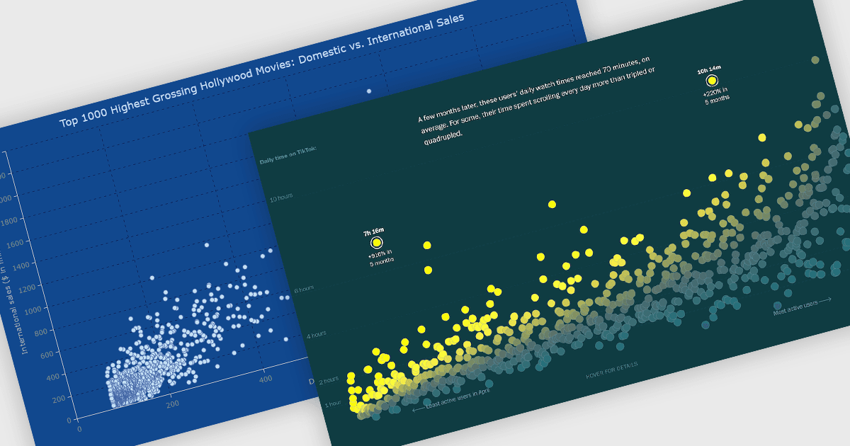
散点图是一种可视化工具,通过在 X 和 Y 轴上绘制数据点,展示两个变量之间的关系。每个点代表一组数值,帮助用户快速识别复杂数据集中的模式、相关性和离群值。散点图能够有效突出表格中可能不易发现的趋势、聚类和异常。借助可自定义的标记、颜色和大小,它们能够清晰地区分数据组。常见应用包括分析销售额与营销投入、比较温度与能耗,或评估客户满意度与定价之间的关系。它将原始数据转化为清晰且可操作的可视化洞察。
一些 JavaScript 图表控件提供散点图,包括:
- DevExtreme Angular Chart(属于 DevExpress 的 DevExtreme Complete)可通过交互式散点图来可视化复杂关系,并使用清晰的数据标记。
- Highcharts Core by Highsoft 支持利用动态工具提示、实时更新以及丰富的定制能力进行详细的散点图可视化,满足专业分析需求。
- AnyChart JS 让你能够创建富有洞察力的散点图,通过灵活的样式与交互性突出相关性、聚类和离群值。
- Syncfusion JavaScript Charts(属于 Syncfusion Essential Studio Enterprise)能够以高性能与高级定制选项实现精确的散点图渲染。
如需深入了解功能和价格,请访问我们的 JavaScript 图表控件对比。