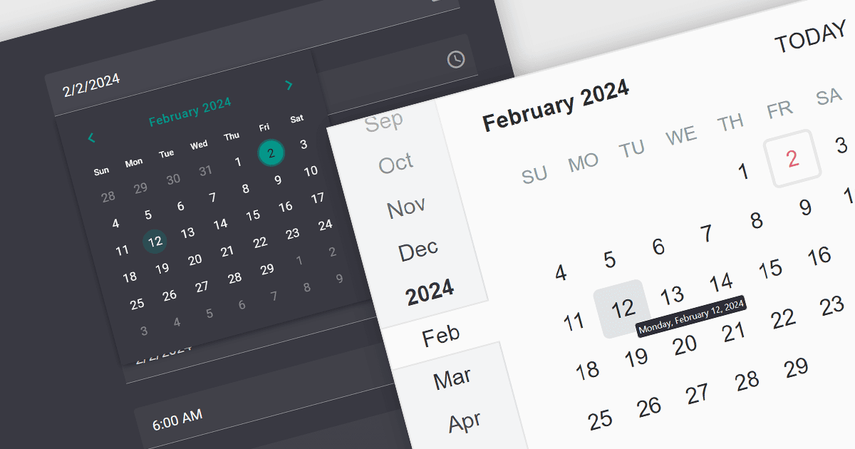
為使用者提供選擇日期的簡單方法

2月 2, 2024
日期編輯器提供了一種直觀、可自訂和高效的方法來輸入、顯示和編輯日期,使日期輸入更快、更容易。

繼續用英語閱讀:

A date editor control is a user interface element designed for selecting and entering dates. It typically combines a text field for manual input with a calendar popup for visual selection. Beyond basic date picking, many controls offer features like time selection, range definition, drop-down lists for pre-defined dates, and even input masks for enforcing specific date formats. Commonly found in applications like forms, booking systems, and calendars, date editor controls streamline date input, improving user experience and data accuracy.

Several React data editor collections provide date editors including:

  • DevExtreme Complete Data Editors (part of DevExtreme Complete) by DevExpress includes DateBox and DateRangeBox UI components for React, offering users flexible date and time entry with support for a range of formats.
  • KendoReact Data Editors (part of KendoReact) by Telerik is a UI kit for React developers that boasts a flexible and customizable interface for date/time editing, with built-in localization and date range selection.
  • Wijmo Input and Editors (part of Wijmo) by MESCIUS (formerly GrapeCity) offers several date/time input controls that fully support React, including an intuitive calendar and time picker with support for valid ranges.
  • Syncfusion Essential Studio for JavaScript Data Editors (part of Syncfusion Essential Studio Enterprise) provides a lightweight date picker component for React with support for range restriction and globalization.

For an in-depth analysis of features and price, visit our React Data Editors comparison.

Compare React Data Editors