揭示多個變數之間的關係

2月 2, 2024
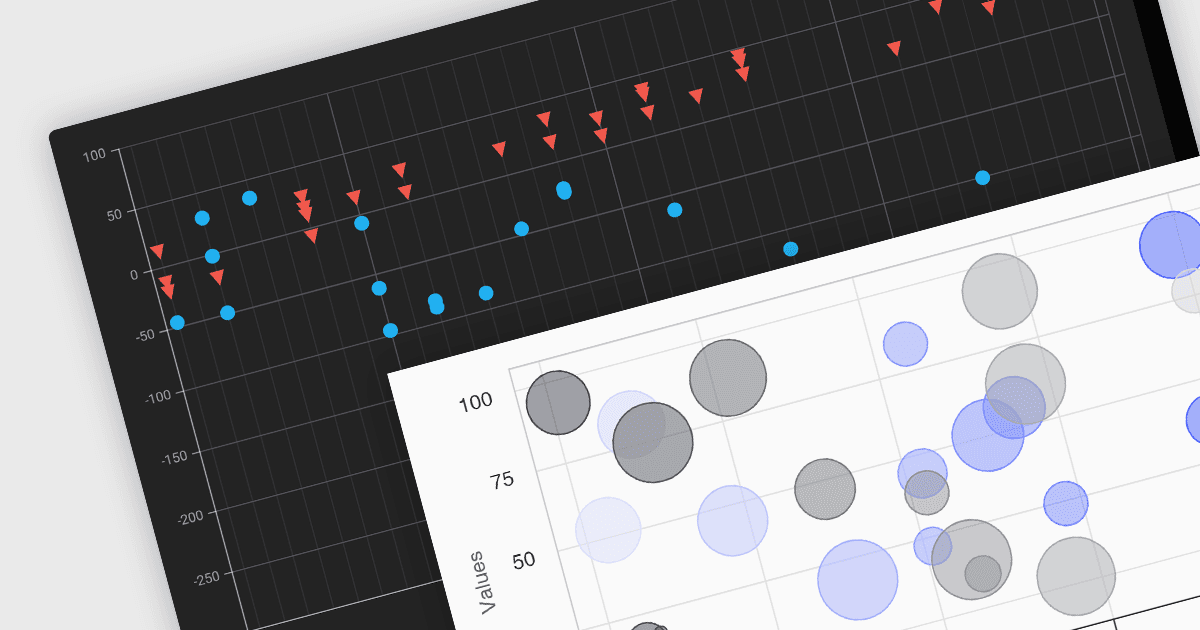
散點圖/氣泡圖有助於您同時跨三個因數發現趨勢、比較量級並識別聚類。

繼續用英語閱讀:

Scatter and bubble charts are used to display data points on a two-dimensional graph. While scatter charts use dots to represent data points, bubble charts add an additional dimension by varying the dot size, often representing volume or intensity. These charts are useful for showing relationships between variables and for identifying patterns or trends in data.

Several Angular chart controls offer scatter and bubble charts including:

  • Highcharts Core lets you craft interactive surface and bubble charts with detailed customization and dynamic animations.
  • DevExtreme Chart (part of DevExtreme Complete by DevExpress) integrates responsive surface and bubble charts into your Angular applications, providing custom themes.
  • Kendo UI for Angular Chart (part of Kendo UI by Telerik) empowers you to add dynamic surface and bubble charts with advanced data binding to your Angular projects.
  • amCharts 5: Charts visualizes multi-dimensional data in engaging surface and bubble charts, offering rich interactivity and drill-down options.

For an in-depth analysis of features and price, visit our Angular chart controls comparison.

Compare Angular Chart Controls