透過響應式版面提升使用者體驗
設計重視包容性與可用性的介面,確保在任何裝置上都能提供一致的使用者體驗,並具備順暢的導覽。
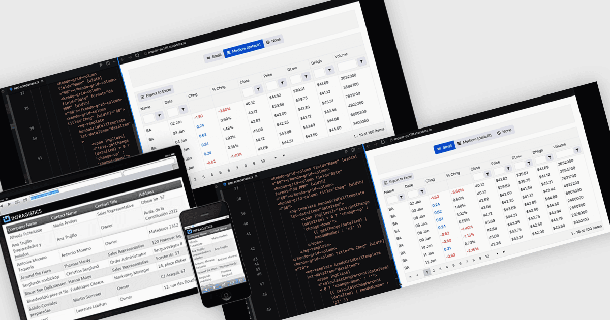
響應式版面是一種設計方法,能讓網頁與應用程式介面自動調整並最佳化其結構、內容與元素,以適應不同的螢幕尺寸與裝置。透過使用彈性格網、可伸縮的影像以及可調整的元件,響應式版面可確保在桌上型電腦、平板與行動裝置上提供一致且使用者友善的體驗。對軟體開發者而言,此做法能簡化跨平台應用程式的建立、提升無障礙性,並透過在各種環境中都能順暢運作的介面來提升使用者滿意度。
多個 Angular 格網元件支援響應式版面,包括:
- IntegralUI Grid(IntegralUI Web 的一部分,由 Lidor Systems 提供)讓您能以響應式版面建立可自訂的資料格網,確保在各種裝置上都能流暢運作。
- Handsontable(由 Handsoncode 提供)透過類 Excel 的格網支援直覺的資料管理,並能根據不同螢幕尺寸動態調整,以達到最高的易用性。
- Kendo UI for Angular Grid(Kendo UI 的一部分,由 Telerik 提供)讓開發者能建立具備強大資料處理能力且在各種裝置與解析度下保持一致性的格網。
- DevExtreme HTML5 JavaScript Data Grid(DevExtreme Complete 的一部分,由 DevExpress 提供)可讓資料呈現具備響應式能力,將自適應版面與進階編輯功能結合。
想深入了解功能與價格,請參閱我們的 Angular 格網控制項比較。