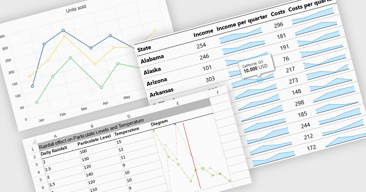
用緊湊的迷你圖簡化分析

1月 29, 2025
透過嵌入到您應用程式中的節省空間的迷你圖,輕鬆識別趨勢、監控實時變化並提高資料可讀性。

繼續用英語閱讀:

Sparkline charts are compact, data-rich visuals that display trends, patterns, and variations in a minimalistic format. Unlike traditional charts, they save space and seamlessly integrate into tables, dashboards, or reports for quick insights. These charts are particularly useful for identifying trends over time, monitoring real-time changes, and enhancing data readability. Common use cases include financial reports to track stock performance, sales dashboards to visualize revenue fluctuations, and performance monitoring tools to highlight system metrics. With their ability to quickly convey key insights in a visually intuitive manner, sparkline charts are an essential tool for data-driven decision-making.

Several React charts offer sparkline chart support, including:

  • DevExtreme Chart (part of DevExtreme Complete by DevExpress) lets you integrate interactive sparkline charts for trend visualization in dashboards, grids, and reports.
  • Ignite UI for React Chart (part of Infragistics Ignite UI) provides lightweight sparkline charts for data visualization within tables, financial reports, and analytics dashboards.
  • KendoReact Chart (part of KendoReact by Telerik) enables embedding sparkline charts to highlight trends, fluctuations, and comparisons within tables, and dashboards.
  • Highcharts Gantt by Highsoft includes sparkline charts for tracking project progress, resource utilization, and performance trends in timeline-based visualizations.

For an in-depth analysis of features and price, visit our React chart comparison.

Compare React Chart Controls