使用地圖圖表視覺化地理趨勢
用生動的地圖圖表轉換資料,讓比較數值更容易、揭示區域模式,並發掘可付諸行動的洞察。
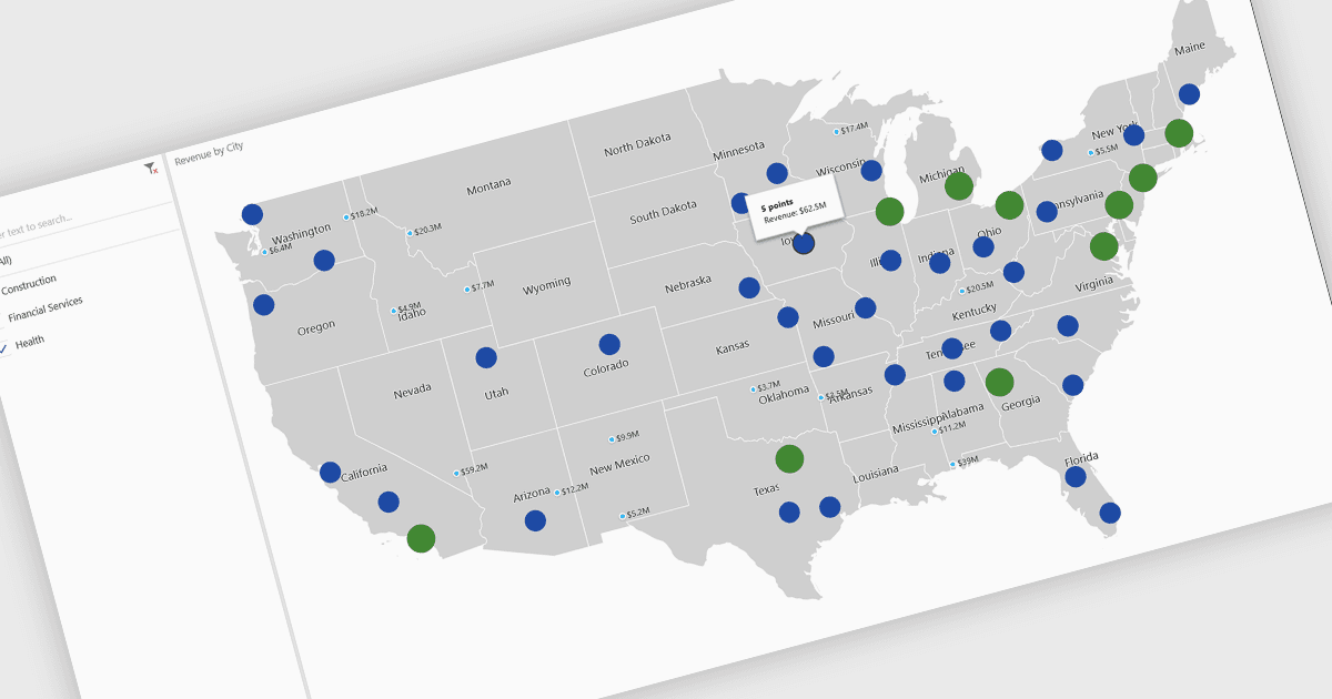
地圖圖表是一種資料的視覺化呈現方式,透過顏色、陰影或標記來顯示跨地理區域的數值,使複雜資訊更容易理解。透過將資料放入空間情境中,地圖圖表可協助使用者快速辨識區域模式、趨勢以及可能在傳統表格或圖表中被忽略的離群值。它們特別適用於比較不同國家、州或縣之間的數值,進而讓地理分布資料的洞察更清晰。常見的使用案例包括呈現人口密度、標示選舉結果、分析依地區劃分的銷售表現,以及展示經濟指標。地圖圖表的主要優點在於能夠簡化複雜的資料集、提供直觀的對照,並透過將數字與真實地點直觀連結,支援以資料為導向的決策。
多種 .NET Core 圖表控制項提供地圖圖表,包括:
- DevExpress WinForms Chart (屬於 DevExpress WinForms)可讓您使用可自訂的地圖圖表來視覺化地理資料,進而實現精準的區域比較。
- ComponentOne Charts for WinForms(屬於 MESCIUS 的 ComponentOne Studio WinForms)可讓您將空間資料集轉換為可互動的地圖圖表。
- Telerik WPF Chart(屬於 Telerik UI for WPF)透過地圖圖表,協助您進行強大的地理敘事,讓使用者能夠看出趨勢並探索各區域的表現。
- Infragistics WPF Charts(屬於 Infragistics Ultimate UI for WPF)可讓您透過地圖圖表,以情境化方式分析資料,結合直觀的設計與清晰的視覺呈現。
如需更深入的功能與價格分析,請造訪我們的 .NET Core 圖表控制項比較。