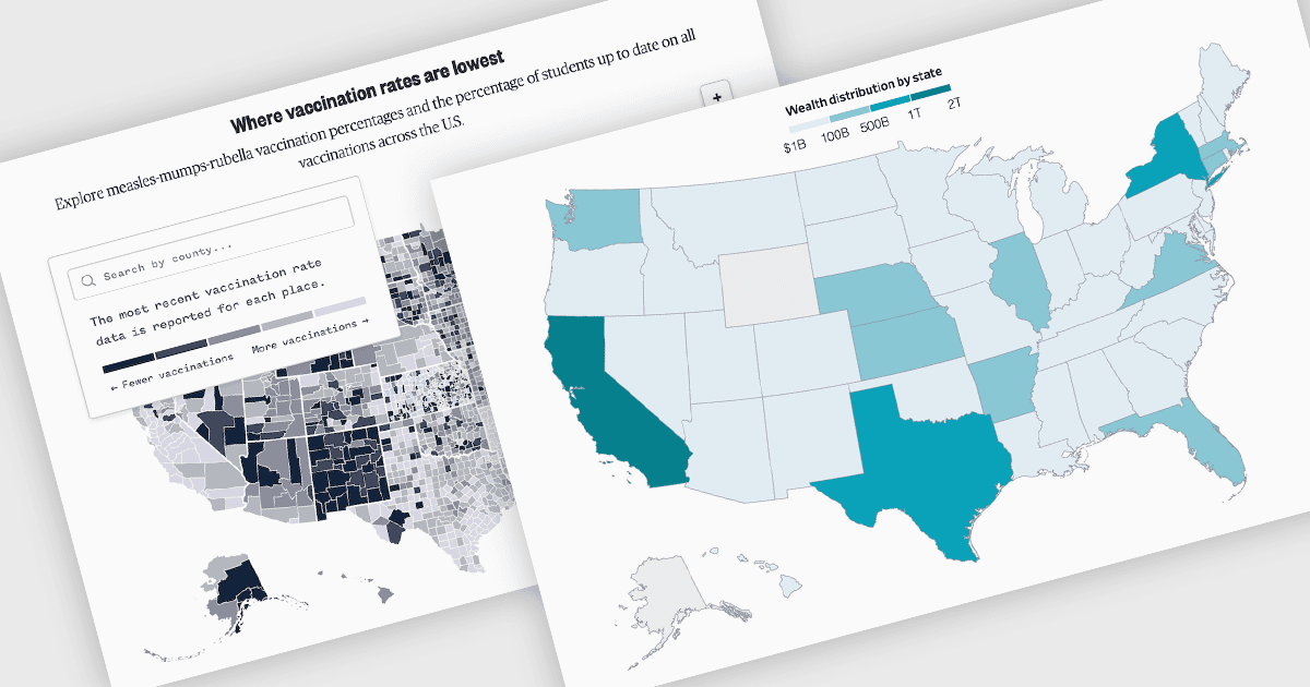
用地圖圖表視覺化地理趨勢

10月 9, 2025
使用互動式地圖圖表透過顏色編碼的地理視圖發現見解,該圖表可以揭示區域模式並突出顯示關鍵指標。

繼續用英語閱讀:

A map chart is a data visualization tool that displays information across geographic regions, helping users uncover spatial patterns, trends, and relationships. By plotting values onto countries, states, or custom areas, it transforms complex datasets into clear, location-based insights. Features like color-coding, zooming, and drill-down navigation allow for interactive exploration and comparison across regions. Common use cases include analyzing sales performance by region, tracking market coverage, visualizing customer distribution, or monitoring demographic trends, all of which support data-driven decision-making with a strong geographic context.

Several JavaScript chart controls offer map charts including:

  • DevExtreme Chart (part of DevExtreme Complete by DevExpress) lets you visualize geographic data with interactive map charts, enabling detailed spatial insights.
  • Highcharts Core by Highsoft allows you to create dynamic map charts with drill-down capabilities, gradient coloring, and responsive designs for geographic data exploration.
  • AnyChart JS facilitates clear spatial analysis through customizable map charts featuring tooltips, projections, and region-based color differentiation for deeper insight.
  • Syncfusion JavaScript Chart (part of Syncfusion Essential Studio Enterprise) lets you build map charts with real-time data updates, heatmap overlays, and intuitive navigation.

For an in-depth analysis of features and price, visit our JavaScript chart controls comparison.

Compare JavaScript Chart Controls