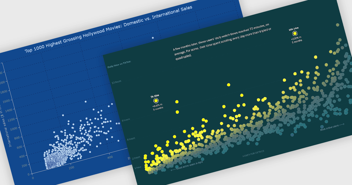
用散點圖比較多個資料集

10月 30, 2025
用可自訂的散點圖輕鬆比較和分析不同的資料數列,該些圖揭示了關係、趨勢和異常值,以獲得更深入的見解。

繼續用英語閱讀:

A scatter chart is a visual tool that displays relationships between two variables by plotting data points on an X and Y axis. Each point represents a value pair, helping users quickly identify patterns, correlations, and outliers within complex datasets. Scatter charts effectively highlight trends, clusters, and anomalies that might not be visible in tables. With customizable markers, colors, and sizes, they clearly differentiate data groups. Common use cases include analyzing sales versus marketing spend, comparing temperature and energy use, or assessing customer satisfaction relative to pricing. This turns raw data into clear and actionable visual insights.

Several JavaScript chart controls offer scatter charts including:

  • DevExtreme Angular Chart (part of DevExtreme Complete by DevExpress) lets you visualize complex relationships through interactive scatter charts with clear data markers.
  • Highcharts Core by Highsoft enables detailed scatter chart visualizations with dynamic tooltips, real-time updates, and rich customization for professional analytics.
  • AnyChart JS allows you to create insightful scatter plots highlighting correlations, clusters, and outliers with flexible styling and interactivity.
  • Syncfusion JavaScript Charts (part of Syncfusion Essential Studio Enterprise) facilitates precise scatter chart rendering with high performance and advanced customization.

For an in-depth analysis of features and price, visit our JavaScript chart controls comparison.

Compare JavaScript Chart Controls