
Infragistics Ultimate UI for WPF
掌握您企業的發展速度、可擴展性和觸摸支援,而這些全部都會在 WPF 控制項中找到。
由以下開發商製作:Infragistics
ComponentSource 開始代理銷售的日期:1996年
掌握您企業的發展速度、可擴展性和觸摸支援,而這些全部都會在 WPF 控制項中找到。
由以下開發商製作:Infragistics
ComponentSource 開始代理銷售的日期:1996年

Infragistics Ultimate UI for WPF is the new name for Infragistics WPF and is also available as part of Infragistics Professional and Infragistics Ultimate.
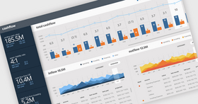
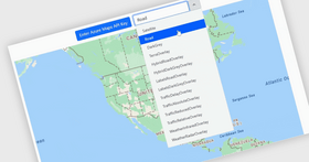
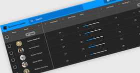
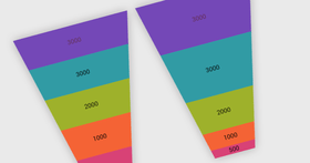
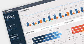
Infragistics Ultimate UI for WPF includes the time-saving controls you need with the lightning-fast, touch-friendly WPF controls. Business and financial analytics, data grids, Touch UI, Office Ribbons, OneNote-inspired radial menus, pivot grids, charts and scheduling features all combine to help you bring modern, engaging apps for desktop and touch-screen devices to market while shortening development time.

Trevor Misfeldt, CEO, CenterSpace Software
Ultimate UI Controls for WPF
Grids & Lists
Charts
Gauges
Data Entry & Display
Frameworks...

Infragistics Ultimate UI for WPF 也以___提供︰
Live Chat現在與我們的Infragistics 專家即時聊天詢問。


聯繫電話: (888) 850 9911
傳真: +1 770 250 6199


 (1)
(1) (1)
(1)