맵 컬렉션 - Highcharts Maps(하이차트 맵)에는 하이차트 맵에 사용하도록 최적화된 맵 컬렉션이 포함되어 있습니다. 일반적인 맵의 경우 적합한 SVG 또는 GeoJSON 맵을 찾거나 그리는 데 문제가 발생합니다. 대신 국가, 지역 및 기타 행정기관 수준의 수백 개의 사전 생성된 맵 중에서 선택할 수 있습니다.
Add platform independent diagramming to your application.
Automatic Layout Algorithms - Diagrams can be arranged automatically by calling a single method and each algorithm provides numerous customization properties. Layouts include: layered, spring-embedder, tree, fractal, treemap and flowchart.
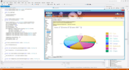
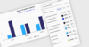
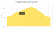
Intelligent Datagrouping - Highcharts Stock의 기본 제공 데이터 그룹화 기능을 통해 수개월 또는 며칠 단위와 같은 선택적 그룹으로 데이터를 빠르게 그룹화하고 표시합니다. 더 작은 범위에서 확대하면, 그룹화가 다시 조정되고 전체 해상도 데이터를 검사할 수 있습니다.


 (23)
(23)

 (68)
(68)

 (5)
(5)