차트 툴팁으로 인터랙티브 인사이트 내장하기
사용자가 인사이트를 탐색하고, 값을 비교하며, 정보에 입각한 결정을 내릴 수 있도록 상세하고 맥락에 맞는 차트 데이터를 즉시 제공합니다.
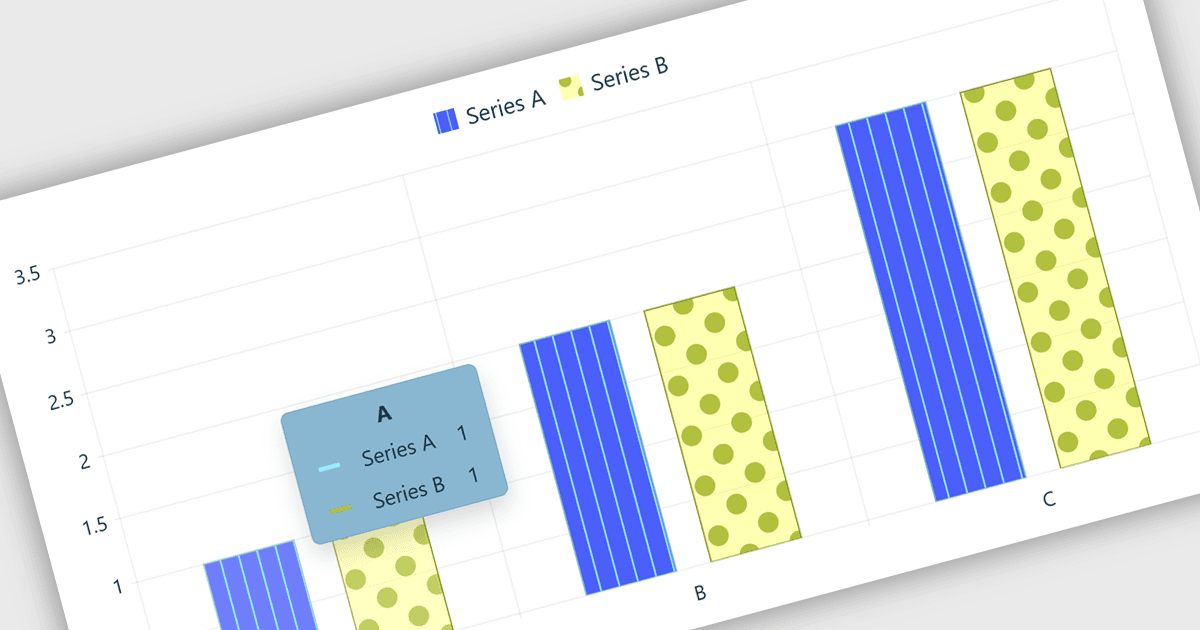
차트 구성 요소의 차트 툴팁은 사용자가 차트 위에 마우스를 올리거나 상호작용할 때 데이터 포인트에 대한 추가 정보를 표시하는 인터랙티브 요소입니다. 이는 소프트웨어 개발자가 차트 자체를 복잡하게 만들지 않고도 자세한 값, 맥락적 인사이트 및 비교를 제공하여 데이터 시각화를 향상시키고 사용성을 개선하며 보다 효과적인 데이터 분석을 지원하고 더욱 매력적인 사용자 경험을 창출하는 데 도움을 줍니다.
여러 React 차트 컨트롤이 툴팁 지원을 제공합니다. 예를 들어:
- DevExtreme React Chart는 마우스 오버 시 자세한 데이터 포인트 정보를 표시하여 시각적 혼란 없이 분석, 비교 및 차트 사용성을 개선합니다.
- KendoReact Charts는 사용자 정의 가능한 툴팁을 통해 맥락적 값과 인사이트를 제공하여 데이터 탐색 및 사용자 참여를 향상시킵니다.
- AnyChart JS는 정확한 차트 정보를 필요에 따라 제공하여 사용자가 트렌드를 효율적으로 해석하는 데 도움을 주는 인터랙티브 데이터 분석을 촉진합니다.
- Syncfusion React Charts는 구성 가능한 툴팁을 통해 풍부한 데이터 세부 정보를 공개하여 더 명확한 시각화와 더 나은 의사 결정을 가능하게 합니다.
기능과 가격에 대한 심층 분석은 저희의 React 차트 컨트롤 비교를 방문하십시오: