


공식 공급 업체
200 이상의 소프트웨어 개발처와 판매 계약을 맺은 공인 디스트리뷰터로서 합법적인 라이선스를 제공합니다.
모든 브랜드 보기.
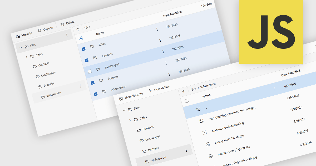
File management and shell components provide developers with tools for working with files, folders, and operating system resources within their applications. These components can provide capabilities such as file browsing, file operations, document handling, and integration with operating system features including file dialogs, shortcuts, shell metadata, and special folders. By providing pre-built functionality for these tasks, file management and shell components can reduce implementation effort and help deliver a familiar user experience.
Several JavaScript UI suites provide you with file management components, including:
For an in-depth analysis of features and price, visit our comparison of JavaScript UI suites.
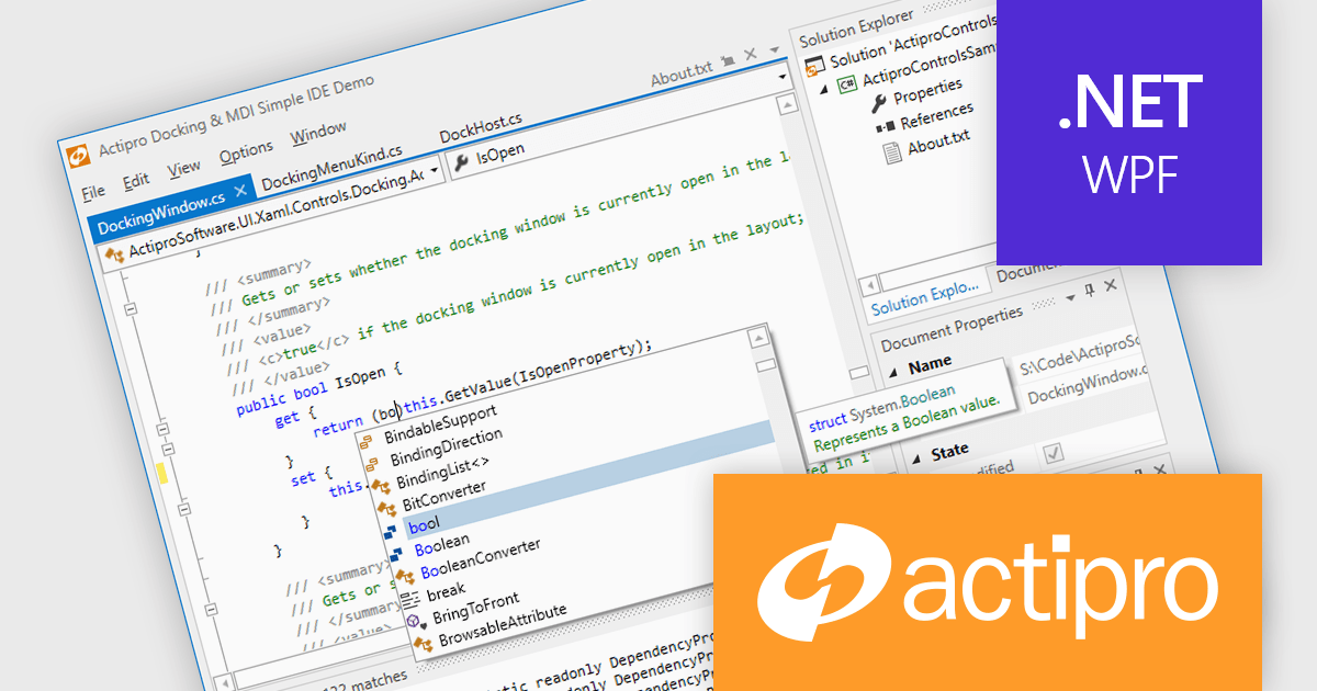
Actipro WPF Studio is a complete suite of WPF UI controls and components for building modern Windows desktop applications, including charts, docking, syntax editing, grids, navigation, gauges, editors, and Microsoft Office style interfaces. Designed to simplify complex application development, it helps developers create professional, feature rich business applications, developer tools, and data driven solutions faster while improving usability and user experience.
Actipro WPF Studio improves WPF application development by providing a comprehensive set of integrated UI controls and components that help developers build professional desktop applications faster and with less custom code. Its included features such as advanced docking, syntax editing, charts, grids, editors, navigation controls, and Microsoft Office style interfaces simplify the creation of complex user experiences while maintaining consistency, performance, and usability across applications. Designed for enterprise software, business tools, and data driven applications, it enables developers to deliver modern, feature rich interfaces more efficiently while reducing development and maintenance effort.
Actipro WPF Studio is licensed per developer and is available as a Perpetual license with 1 year support and maintenance. See our Actipro WPF Studio licensing page for full details.
For more information, see our Actipro WPF Studio product page.
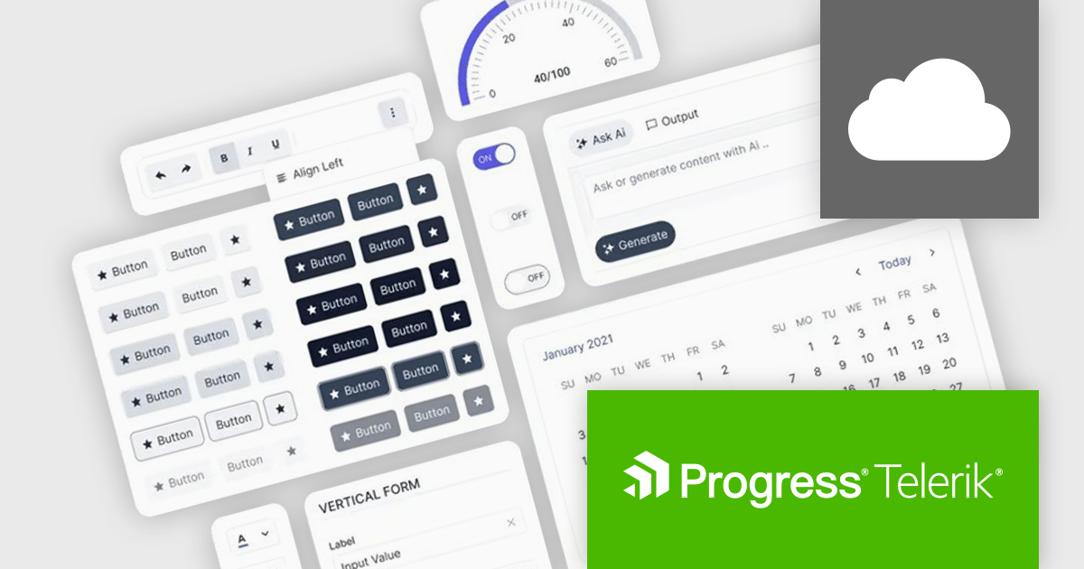
Progress ThemeBuilder by Telerik is a comprehensive visual design tool that accelerates user interface customization for Telerik and Kendo UI web components. ThemeBuilder enables you to style virtually every appearance-related property of the UI components, from top-level elements to the smallest of details, without requiring direct CSS manipulation. It integrates with existing development processes and allows developers to create, modify, and maintain consistent and visually appealing themes across applications. This tool significantly reduces the time and effort required for UI customization and makes it easy to align them with branding and design specifications.
The Progress ThemeBuilder 2026 Q2 update introduces support for the new Meridian theme, giving developers greater flexibility to design and customize modern user interfaces through an integrated theming workflow. With access to updated styles, components, and design tokens directly within ThemeBuilder, teams can more easily create polished and consistent application experiences that align with the latest Kendo UI design system. The update also streamlines theme management and customization, helping developers accelerate UI development while maintaining visual consistency and brand alignment across projects.
To see a full list of what's new in 2026 Q2, see our release notes.
Progress ThemeBuilder is licensed per user and is available as an annual license with a one year support subscription, which is available in three tiers: Lite, Priority or Ultimate. See our Progress ThemeBuilder licensing page for full details.
For more information, see our Progress ThemeBuilder product page.
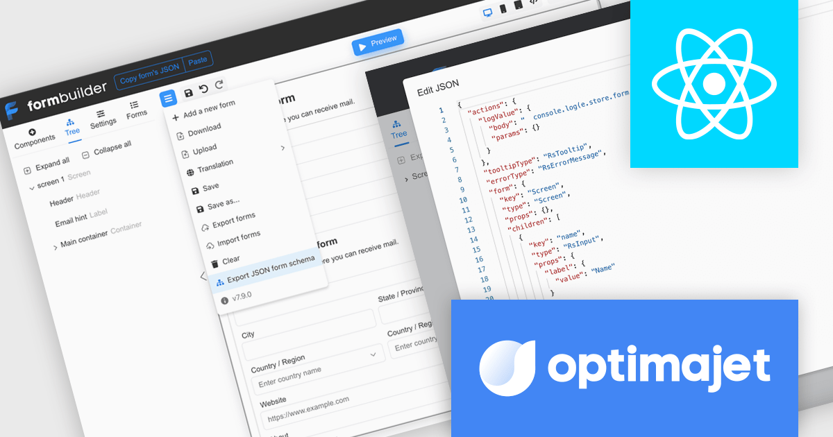
Optimajet FormEngine is a drag-and-drop React form builder that lets teams create, manage, and render complex web forms without writing frontend code. It allows developers and business users to visually design forms, store them as JSON, and render them at runtime. As a React JS library, it easily integrates into existing applications while giving developers full control over form logic, structure, and data flow, making it well suited for complex data collection.
Optimajet FormEngine enables JSON Schema validation for forms, allowing developers to validate form JSON directly within their IDE, identify structural issues, incorrect data types, and unsupported configurations early in the development process, and enforce a consistent, well-defined structure across all forms. By providing real-time feedback, inline error highlighting, and autocomplete suggestions, it improves accuracy and reduces the need for repeated testing cycles, helping developers work more efficiently while minimizing runtime errors and ensuring more reliable form implementations.
Optimajet FormEngine is licensed based on usage type (internal commercial use, public web/SaaS, or OEM embedding), number of domains for the visual editor, and access to additional ready-made components. Licenses are perpetual and include 6 months or 1 year of updates and support. See our Optimajet FormEngine licensing page for full details.
For more information, visit our Optimajet FormEngine product page.
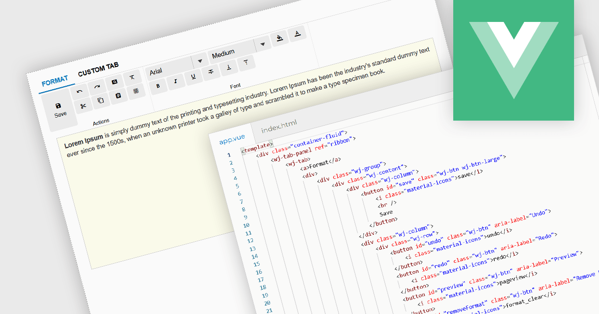
Ribbon bars are graphical user interface (GUI) patterns that organize commands and features into a series of tabs, each containing grouped controls such as buttons, dropdowns, and galleries. Widely adopted in modern software applications, ribbons present functionality in a structured and visually accessible layout to improve discoverability. This approach reduces reliance on deeply nested menus and toolbars, enabling users to locate relevant tools more quickly based on context.
Several Vue.js user interface suites provide ribbon functionality, including:
For an in-depth analysis of features and price, visit our comparison of Vue.js UI suites.
전화 : 00798 14 800 6332
팩스 : +1 770 250 6199


