





공식 공급 업체
200 이상의 소프트웨어 개발처와 판매 계약을 맺은 공인 디스트리뷰터로서 합법적인 라이선스를 제공합니다.
모든 브랜드 보기.
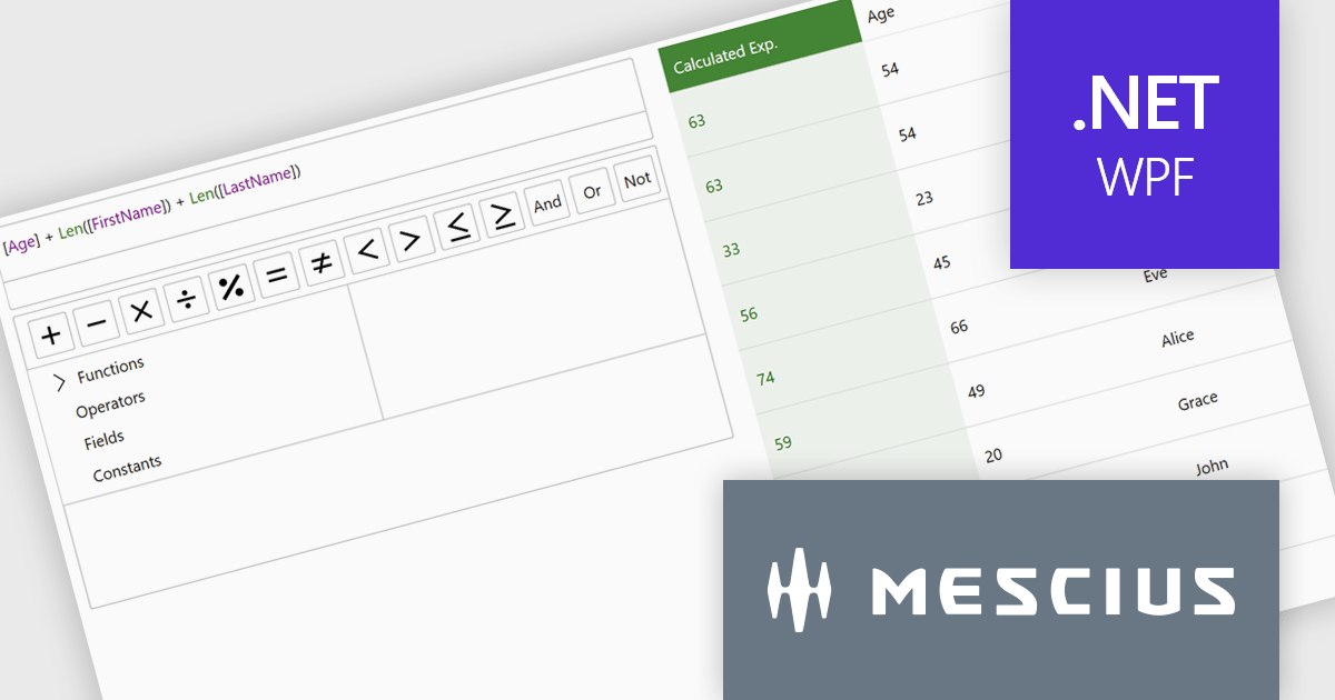
ComponentOne Studio Enterprise is a comprehensive suite of .NET UI controls developed by MESCIUS (formerly GrapeCity) designed for building rich, interactive desktop, web, and mobile applications. It provides developers with a broad range of tools and components-including data grids, charts, reports, input controls, and advanced data visualization features-for platforms such as WinForms, WPF, ASP.NET Core, Blazor, WinUI, and .NET MAUI. The suite emphasizes performance, flexibility, and ease of integration, helping teams create consistent, feature-rich user experiences across multiple application types while maintaining a unified development approach.
The ComponentOne Studio Enterprise 2025 v2 update introduces a modern WPF ExpressionEditor that enables developers to integrate a complete runtime formula-building experience directly into their applications. It allows end users to create, edit, and validate logical expressions using familiar Visual Studio–style code completion, syntax highlighting, and real-time error reporting, while also providing a set of built-in operators, constants, and aggregate, logical, mathematical, and conversion functions. By offering both a lightweight expression text box and a full-featured formula panel, the update reduces the need for custom expression editors, shortens development time, and improves the reliability and usability of data-driven application logic.
To see a full list of what's new in 2025 v2, see our release notes.
ComponentOne Studio Enterprise is licensed per developer on a perpetual basis and includes a 12 month subscription. Priority Support is also available. See our ComponentOne Studio Enterprise licensing page for full details.
Learn more on our ComponentOne Studio Enterprise product page.
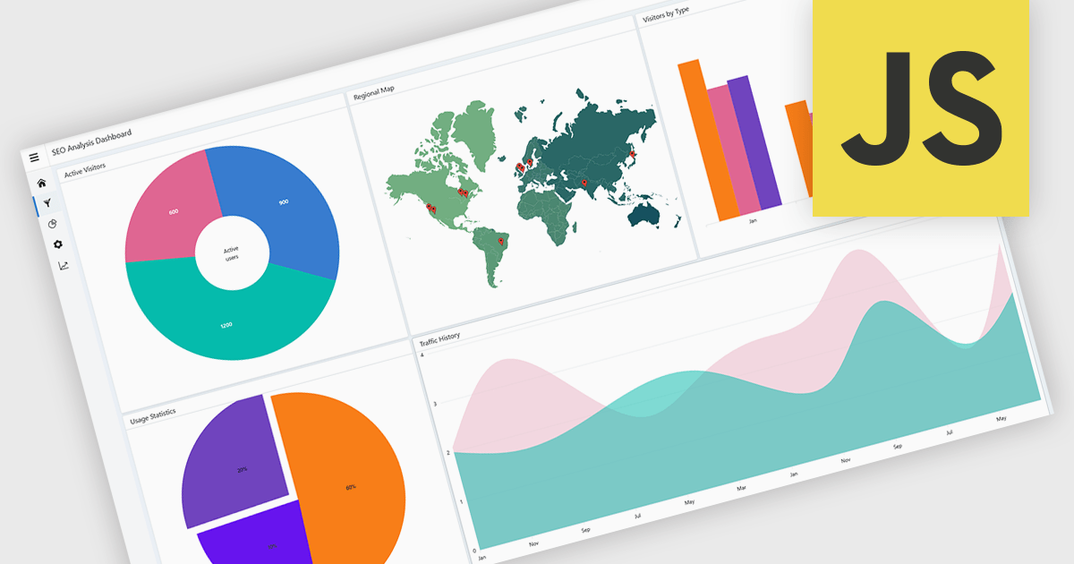
A layout component provides a structured foundation for building modern applications. It offers predesigned, configurable layout templates that ensure visual consistency, reduce development time, and eliminate common alignment or scalability issues by handling spacing, breakpoints, and component organization automatically. The result is a cleaner, more intuitive user experience across devices without requiring extensive custom CSS or layout logic. Common use cases include dashboards with resizable panels, master-detail views for data management, admin portals, and applications that need predictable, responsive page structures to support complex UI components like charts, forms, and data grids.
Several JavaScript UI suites offer layout components including:
For an in-depth analysis of features and price, visit our JavaScript UI suites comparison.
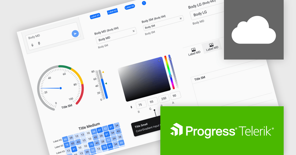
Progress ThemeBuilder by Telerik is a comprehensive visual design tool that accelerates user interface customization for Telerik and Kendo UI web components. ThemeBuilder enables you to style virtually every appearance-related property of the UI components, from top-level elements to the smallest of details, without requiring direct CSS manipulation. It integrates with existing development processes and allows developers to create, modify, and maintain consistent and visually appealing themes across applications. This tool significantly reduces the time and effort required for UI customization and makes it easy to align them with branding and design specifications.
The Progress ThemeBuilder 2025 Q4 update introduces a new Typography module that gives developers centralized control over font families, sizes, weights, line heights, and letter spacing, making it easier to maintain consistency across complex UI designs. By aligning typography settings with the existing design-system structure used for colors and spacing, it improves configuration and helps ensure predictable styling across components. The update also provides complete typography variables that can be leveraged for automated or AI-assisted theme generation, enabling faster iteration and more efficient customization.
To see a full list of what's new in 2025 Q4, see our release notes.
Progress ThemeBuilder is licensed per user and is available as an annual license with a one year support subscription, which is available in three tiers: Lite, Priority or Ultimate. See our Progress ThemeBuilder licensing page for full details.
For more information, see our Progress ThemeBuilder product page.
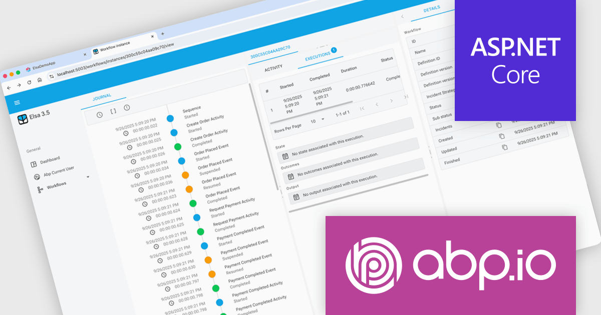
ABP Platform is a comprehensive framework designed to accelerate the development of enterprise software solutions by offering an opinionated architecture built on best practices for .NET and ASP.NET Core. It equips developers with the essential infrastructure, production-ready startup templates, pre-built application modules, and modern UI themes needed to build robust, scalable, and maintainable applications. With powerful tooling, detailed guides, and extensive documentation, ABP Platform improvs implementation, reduces repetitive tasks, and ensures consistency across projects. Ideal for organizations seeking to enhance productivity and maintain high-quality standards, it enables teams to focus on delivering business value while the platform handles architectural complexity and automation.
The ABP Platform 10.0 update introduces the Elsa Workflow module, giving developers a fully integrated way to design and execute visual, event-driven processes within both monolithic and microservice architectures. With built-in support for Elsa Studio, developers can model and manage behavior through a hybrid UI while relying on ABP to handle execution, state management, and service interactions, resulting in a more consistent and maintainable approach to orchestrating application processes.
To see a full list of what's new in version 10.0.0, see our release notes.
The ABP Platform is available as a Team, Business or Enterprise license, which entitles developers to use the platform's Pro features and provides software updates and technical support for 1 year. See our ABP Platform licensing page for full details.
For more information, visit our ABP publisher page.
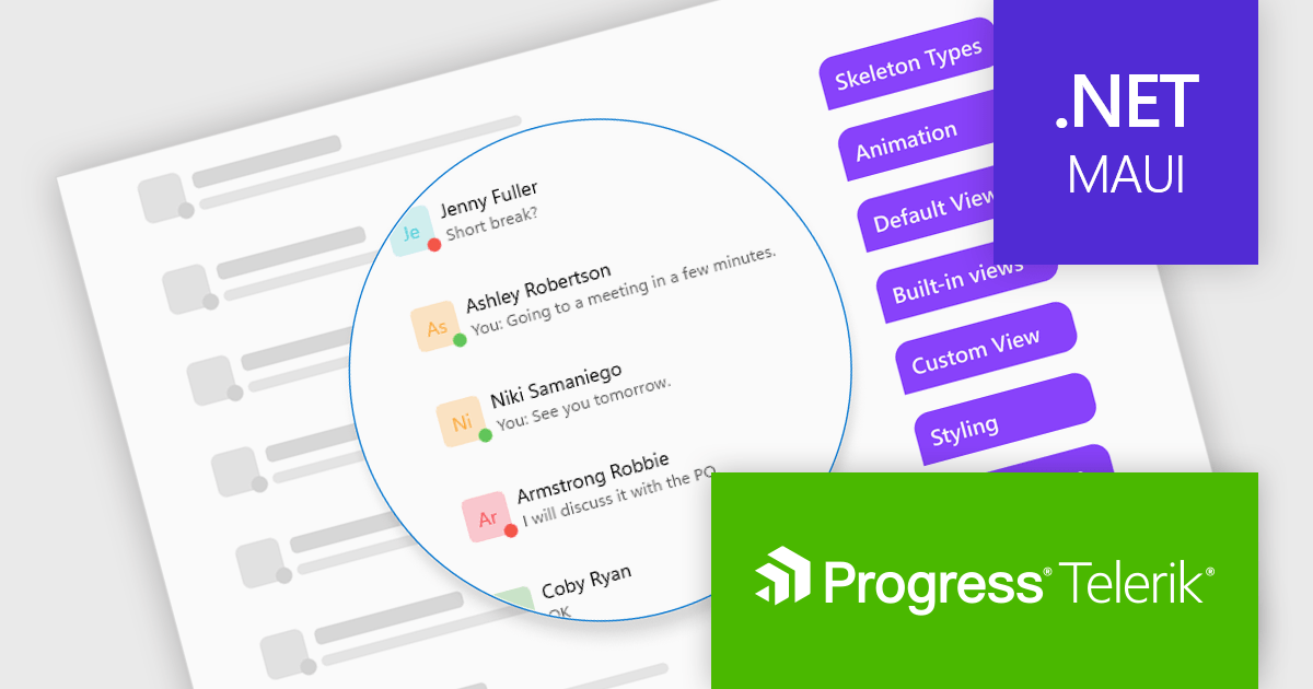
Telerik UI for .NET MAUI is a robust suite of user interface components designed to simplify the creation of cross-platform applications using .NET Multi-platform App UI (MAUI). It offers a wide range of pre-built controls, including charts, grids, and navigation elements, enabling developers to build visually appealing, high-performance apps for Android, iOS, Windows, and macOS from a shared codebase. By ensuring a consistent user experience across platforms, it accelerates development and allows a focus on functionality, making it ideal for business applications, dashboards, and data-driven projects.
The Telerik UI for .NET MAUI 2025 Q4 update introduces the new Skeleton Component, which enables developers to present structured loading placeholders that match the layout of their final content. This improves perceived responsiveness by keeping the interface stable while data is retrieved, reducing layout shifts and allowing users to understand the expected structure of the page before it fully renders. With built-in templates for common UI patterns, the component improves implementation and helps teams deliver more consistent, polished loading experiences across their applications.
To see a full list of what's new in 2025 Q4 (v12.0.0), see our release notes.
Telerik UI for .NET MAUI is licensed per developer and has two licensing models: an annual Subscription License and a Perpetual License. The Subscription license provides access to the latest product updates, technical support, and exclusive benefits for a flat annual fee, and must be renewed to continue using the software. The Perpetual license is a one-time purchase granting access to the current released version and includes a one-year subscription for product updates and technical support. After this initial period, users can choose to renew the subscription element to continue receiving updates and support; otherwise, they may continue using the installed version available during their active subscription term but will forgo future updates and support. See our Telerik UI for .NET MAUI licensing page for full details.
Telerik UI for .NET MAUI is available individually or as part of the following products:
전화 : 00798 14 800 6332
팩스 : +1 770 250 6199


