




공식 공급 업체
200 이상의 소프트웨어 개발처와 판매 계약을 맺은 공인 디스트리뷰터로서 합법적인 라이선스를 제공합니다.
모든 브랜드 보기.
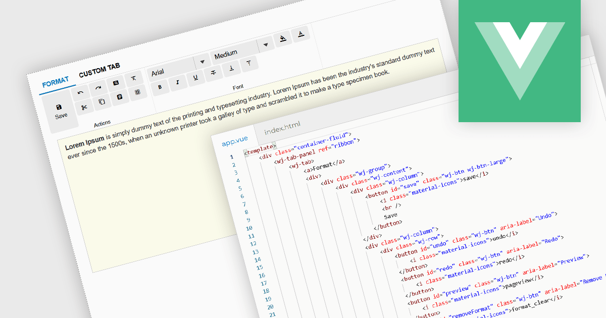
Ribbon bars are graphical user interface (GUI) patterns that organize commands and features into a series of tabs, each containing grouped controls such as buttons, dropdowns, and galleries. Widely adopted in modern software applications, ribbons present functionality in a structured and visually accessible layout to improve discoverability. This approach reduces reliance on deeply nested menus and toolbars, enabling users to locate relevant tools more quickly based on context.
Several Vue.js user interface suites provide ribbon functionality, including:
For an in-depth analysis of features and price, visit our comparison of Vue.js UI suites.
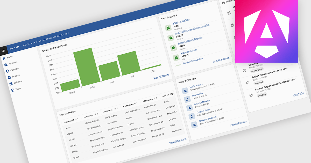
Layout components in UI suites provide structured systems for arranging and aligning interface elements, giving developers a consistent and efficient way to build user interfaces. By simplifying positioning and handling responsive behavior, they reduce development complexity while ensuring a cohesive design across screens and devices. This leads to faster development, improved maintainability, and a better user experience. Common use cases include creating responsive dashboards, organizing forms, structuring navigation, and building applications that need to adapt across multiple devices.
Several Angular UI suites offer layout components including:
For an in-depth analysis of features and price, visit our Angular UI suites comparison.

ComponentSource and Optimajet have built a strong partnership focused on helping developers create, manage, and render complex web forms. OptimaJet provides flexible, developer-friendly components designed to simplify business process management, enabling teams to build scalable, efficient applications while reducing development time and cost.
At the core of their offering is Optimajet FormEngine, which helps developers to rapidly design dynamic, customizable forms with minimal effort. It supports complex logic and data handling, and provides the flexibility needed to adapt forms to specific business requirements across a wide range of industries.
This collaboration enables ComponentSource to further differentiate its product portfolio by offering advanced form-building solutions that meet modern development demands. By distributing OptimaJet’s products globally, ComponentSource ensures developers worldwide can easily access, evaluate, and implement these tools, strengthening its position as a trusted source for high-quality development components.
Learn more about Optimajet.
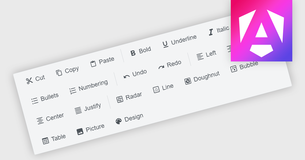
Toolbar components are a common feature in modern Angular UI suites, providing a structured way to present frequently used commands within an application. Typically displayed as a horizontal or vertical strip of buttons, icons, and interactive controls, a toolbar helps developers organize actions in a clear and accessible location. In Angular-based applications, toolbar components are often designed to work with the framework's component architecture, supporting features such as templating, responsive layouts, and integration with other UI elements like menus, dropdowns, and input controls. This allows developers to build consistent command surfaces while maintaining flexibility in how functionality is exposed to users.
Several Angular UI suites offer toolbar components including:
For an in-depth analysis of features and price, visit our Angular UI suites comparison.
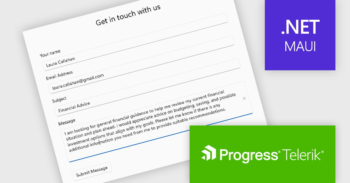
Telerik UI for .NET MAUI is a robust suite of user interface components designed to simplify the creation of cross-platform applications using .NET Multi-platform App UI (MAUI). It offers a wide range of pre-built controls, including charts, grids, and navigation elements, enabling developers to build visually appealing, high-performance apps for Android, iOS, Windows, and macOS from a shared codebase. By ensuring a consistent user experience across platforms, it accelerates development and allows a focus on functionality, making it ideal for business applications, dashboards, and data-driven projects.
The Telerik UI for .NET MAUI 2026 Q1 update introduces a new Editor component that enables developers to implement robust multi-line text input with consistent cross-platform behavior and predictable performance. Designed for handling long-form content such as comments, notes, and detailed form entries, the component supports both vertical and horizontal scrolling to maintain usability without compromising layout. Full keyboard and mouse support ensures familiar text selection, cursor movement, and editing interactions, while built-in customization options such as watermarks, read-only states, and configurable border styles allow developers to align the editing experience with specific application and UI requirements.
To see a full list of what's new in 2026 Q1 (v13.0.0), see our release notes.
Telerik UI for .NET MAUI is licensed per developer and has two licensing models: an annual Subscription License and a Perpetual License. The Subscription license provides access to the latest product updates, technical support, and exclusive benefits for a flat annual fee, and must be renewed to continue using the software. The Perpetual license is a one-time purchase granting access to the current released version and includes a one-year subscription for product updates and technical support. After this initial period, users can choose to renew the subscription element to continue receiving updates and support; otherwise, they may continue using the installed version available during their active subscription term but will forgo future updates and support. See our Telerik UI for .NET MAUI licensing page for full details.
Telerik UI for .NET MAUI is available individually or as part of the following products:
전화 : 00798 14 800 6332
팩스 : +1 770 250 6199


