by Nevron - 상품타입: Add-In / ASP.NET AJAX (ATLAS) / .NET Class / Web Part
Deliver advanced charting solutions to the SharePoint environment. 
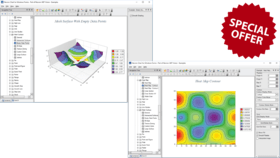
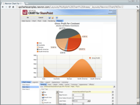
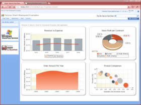
Nevron Chart for SharePoint is an advanced chart web part, which delivers a complete set of 2D and 3D charting types, highly customizable axes, advanced data analysis features, tight data integration and visual effects to your SharePoint sites. It combines the Nevron Charting engine for ASP.NET together with the elegant Nevron Pivot Data Aggregation engine. This allows Nevron Chart for SharePoint users to create complex pivot charts visually and directly in the SharePoint environment.
일반 적인 소비자 가격은 하기에 표시되어 있습니다. 고객님의 할인가격은 표시 하시려면 로그인 해주시기 바랍니다.
| 주문 | $ 1,208.03 | 1 Server License * 메이커 제품 번호: N.CH.SP.110.ENT |
다운로드 (31.4 MB) | |
| 주문 | $ 1,087.22 | 1 Server License, per Server from 3 up to 4 Servers (Minimum quantity 3) * 메이커 제품 번호: N.CH.SP.110.ENT |
다운로드 (31.4 MB) | |
| 주문 | $ 966.42 | 1 Server License, per Server from 5 up to 9 Servers (Minimum quantity 5) * 메이커 제품 번호: N.CH.SP.110.ENT |
다운로드 (31.4 MB) | |
| 주문 | $ 845.62 | 1 Server License, per Server from 10 up to 19 Servers (Minimum quantity 10) * 메이커 제품 번호: N.CH.SP.110.ENT |
다운로드 (31.4 MB) | |
| 주문 | $ 724.82 | 1 Server License, per Server from 20 Servers (Minimum quantity 20) * 메이커 제품 번호: N.CH.SP.110.ENT |
다운로드 (31.4 MB) |
| 주문 | $ 1,549.28 | 1 Server License with Subscription * 메이커 제품 번호: N.CH.SP.110.ENT+SSCR |
다운로드 (31.4 MB) | |
| 주문 | $ 1,394.35 | 1 Server License with Subscription, per Server from 3 up to 4 Servers (Minimum quantity 3) * 메이커 제품 번호: N.CH.SP.110.ENT+SSCR |
다운로드 (31.4 MB) | |
| 주문 | $ 1,239.42 | 1 Server License with Subscription, per Server from 5 up to 9 Servers (Minimum quantity 5) * 메이커 제품 번호: N.CH.SP.110.ENT+SSCR |
다운로드 (31.4 MB) | |
| 주문 | $ 1,084.49 | 1 Server License with Subscription, per Server from 10 up to 19 Servers (Minimum quantity 10) * 메이커 제품 번호: N.CH.SP.110.ENT+SSCR |
다운로드 (31.4 MB) | |
| 주문 | $ 929.57 | 1 Server License with Subscription, per Server from 20 Servers (Minimum quantity 20) * 메이커 제품 번호: N.CH.SP.110.ENT+SSCR |
다운로드 (31.4 MB) |
| 주문 | $ 623.03 | 1 Server Subscription Renewal License * 메이커 제품 번호: N.CH.SP.110.ENT.SSCR |
확인 | 다운로드 (31.4 MB) |
| 주문 | $ 560.72 | 1 Server Subscription Renewal License, per Server from 3 up to 4 Servers (Minimum quantity 3) * 메이커 제품 번호: N.CH.SP.110.ENT.SSCR |
확인 | 다운로드 (31.4 MB) |
| 주문 | $ 498.42 | 1 Server Subscription Renewal License, per Server from 5 up to 9 Servers (Minimum quantity 5) * 메이커 제품 번호: N.CH.SP.110.ENT.SSCR |
확인 | 다운로드 (31.4 MB) |
| 주문 | $ 436.12 | 1 Server Subscription Renewal License, per Server from 10 up to 19 Servers (Minimum quantity 10) * 메이커 제품 번호: N.CH.SP.110.ENT.SSCR |
확인 | 다운로드 (31.4 MB) |
| 주문 | $ 373.82 | 1 Server Subscription Renewal License, per Server from 20 Servers (Minimum quantity 20) * 메이커 제품 번호: N.CH.SP.110.ENT.SSCR |
확인 | 다운로드 (31.4 MB) |
가격에는 ComponentSource의 기술지원 요금이 포함되어 있습니다. 또한 다운로드 판매를 하고 있는 상품의 대부분은 온라인 백업요금이 포함되어 있어서 구입날로부터 30일 이내에 새로운 버전이 발매된 경우 무료로 업그레이드해 드리고 있습니다. 모든 주문에 대해서 당사표준 계약조건 및 반품조건 의 내용이 적용됩니다. 다음의 경우,고객 서비스로연락하시기 바랍니다. (상기의 리스트에 게재되지 않은 대량의 라이센스나 구 버전 등의 라이센스 옵션이 필요한 경우)
일반 적인 소비자 가격은 상기에 표시되어 있습니다. 고객님의 할인가격은 표시 하시려면 로그인 해주시기 바랍니다.
Nevron Chart for SharePoint 2007/2010 2011.1 introduces:
Additional Improvements:
Nevron Vision for SharePoint 2010 Vol. 1 introduces:
Fixed problems:
Nevron Chart for SharePoint General Features
Nevron Chart for SharePoint Charting Types
Bar Charts (Horizontal and Vertical) - available in 2D and 3D - A Bar Chart displays a sequence of horizontal or vertical bars (shapes) of lengths proportional to the value that they represent. Bar charts are usually used for comparing two or more values or representing the contribution of each value to a total (stacks).
Area Charts - available in 2D and 3D - Area Charts display a sequence of filled areas between the axis (or an origin line) and the value line. Area charts are usually used for comparing two or more values or representing the contribution of each value to a total (stacks), usually over time or other X measurement.
Smooth Area Charts - available in 2D and 3D - Smooth Area charts are similar to Standard Area charts, the difference being that the successive data points are connected with cubic spline segments instead of straight lines.
Line Charts - available in 2D and 3D - A Line Chart displays a sequence of line segments that are sequencially connected. Line charts are usually used to show a trend or how a value contributes to a trend total (stacks), usually over time or other X measurement.
Smooth Line Charts - available in 2D and 3D - Smooth Line charts are similar to Line charts, the difference being that the successive data points are connected with cubic spline segments instead of straight lines.
Step Line Charts - available in 2D and 3D - Step Line charts are similar to Line charts, the difference being that the successive data points are connected with horizontal and vertical segments instead of straight lines.
Pie Charts - available in 2D and 3D - A Pie Chart is a circular chart divided into sectors, where the arc length of each sector is proportional to the quantity it represents. Pie Chart data labels support - Center, Rim, Spider and Nonoverlapping Labels.
Point Chart Subtypes: - Series, XY Scatter, XYZ Scatter
Bubble Charts - available in 2D and 3D - Bubble Charts display multi dimensional data as points in a Cartesian coordinate system. The size of each point is determined by an additional size value. The actual size of the bubble is interpolated to be in the MinSize - MaxSize range.
Float Bar Charts - available in 2D and 3D - A Floating Bar Chart displays a sequence of vertical bars, each bar representing a one-dimensional value range. A Floating Bar chart can be used as a Gantt chart if the Y axis is in date-time scale mode. Gantt charts are popular in project management for planning the use of resources over time.
High Low Charts - available in 2D and 3D - A High-Low Chart displays a sequence of data points, each representing a one-dimensional value range. The begin values of consecutive data points are connected with a "low" line. The end values are connected with a "high" line. The area between these two lines is filled with different colors, depending on whether the "high" line runs above or below the "low" line.
Stock Charts - available in 2D and 3D - Stock charts are used to plot stock data, usually over time. Stock charts use color coding to distinguish between stock prices, which went up or down when the stock closed.
Funnel Charts - available in 2D and 3D - The Funnel Chart is similar to a Stacked Percent Bar Chart with only one category. It represents 100% of the summary values for the data items included in the chart. Funnel Charts are often used to represent stages in a sales process and show the amount of potential revenue for each stage. This type of chart can also be useful in identifying potential problem areas in an organization's sales processes. Nevron Funnel Chart provides control over labeling, neck width and height and points gap.
Radar Charts - available only in 2D - A Radar Chart plots the values of each category along a separate axis that radiates from the center of the chart and ends on the outer ring. A line connects all the values from the same series and optionally the area enclosed by the line can be filled.
Polar Charts - available only in 2D - Polar Charts display 2-dimensional data points in a polar coordinate system. The position of a point is specified by its distance from the center and a rotation angle. The points are connected by a line and optionally the area enclosed by the line can be filled.
Surface Charts - available only in 3D - Surface Charts display a surface connecting the adjacent data points. Multiple series are not supported by surface charts. That is why only one series is created which takes the properties of the first values data grouping displayed in the Surface Chart chart area. Additional series append values to this series (in the case of a Mesh Surface) or add depth to the surface grid (in the case of Grid Surface).
Combo Charts - available in 2D and 3D - Combo Charts are used to combine certain series types within the same chart area. Series types are specified per values data groupings. There are many per series type options. You can combine the following series types: Bar, Area, Smooth Area, Line, Smooth Line, Step Line, Point, Bubble, High Low and Stock.
Nevron Chart for SharePoint Chart Axes Features - Complete set of axis-related features designed to target even the most compelling charting requirements. The axes are largely automatic, allowing you to focus on your project, but if needed you can customize every aspect of their appearance and behavior.
Nevron Chart for SharePoint Data Aggregation Features
Nevron Chart for SharePoint Additional Customization Properties – The following is a brief list of some of the most important additional customization options that are visually exposed by the chart designer:
Walls
Legends
Per Series (Values Data Groupings) Properties
Data Groupings Editors
Rendering
Appearance Customizations
Nevron Chart for SharePoint Advanced Features
New Support Portal (http://support.nevron.com)
Nevron technical support is based on a ticketing system. The new system aims to provide higher level support services, support ticket tracking and a better customer experience. By using the support portal Nevron will ensure that their support services are always competent and directly address your problems. In addition to Nevron’s services, Nevron also provide bug fixes, product enhancements, and on-going minor product upgrades.
Nevron customers will receive 5 free support tickets with their purchase. Subscription customers will receive 10 support tickets and one full year of major version releases.
When submitting a new support ticket, customers will be provided with suggestions which can assist prior to using the ticket.
Additional technical support tickets can be obtained if needed.
에서 제공개발처/발매처
주요 카테고리
관련 상품
관련 카테고리