신규 Heat Map 시리즈, Polar Chart 범위와 벡터 하위유형 및 Microsoft SharePoint 2016에 대한 서포트를 제공합니다.
11월 22, 2016
신규 버전
기능
Support for Microsoft SharePoint Server 2016.
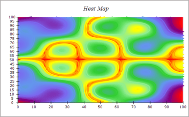
New Heat Map series - this charting type lets you display a matrix of elevation values as a grid of colors, which are taken from an associated palette. In addition the heat map series can show a set of contour lines (isolines) that cross specified elevation values.
New Sub-types for Polar Charts - the Polar chart contains the Polar Range and Polar Vector chart sub-types. Both chart sub-types allows you to visualize a pair of polar coordinates as a range or vector respectively.
New Table Scale - the Table Scale can visualize the data values of the series represented in a particular category. Table rows can be annotated with a series name and table columns can be annotated with the category name. This feature is very useful for stacked and clustered bar charts.
Value Palette - the Bar, Area, Smooth Area, Range and High Low series have been extended to support a feature called value palette. This feature allows you to color code the data points of the series depending on a their value so that the chart becomes more visually appealing to the user.
Bar Chart type supports a Histogram chart subtype with many options for controlling the histogram bin ranges.
Axis Scales have the ability to hide the first / last automatically generated label.
New Heat Map series in Nevron Chart for SharePoint.