Align Data Labels with Key Statistical Values
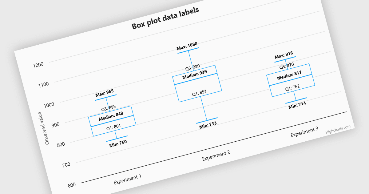
Highcharts v13 improves the readability of box plot charts by aligning data labels with minimum, maximum, median, and quartile values.
Highcharts is a JavaScript charting framework that allows web developers and data analysts to generate dynamic, visually appealing charts and graphs for websites and web applications. It can display a variety of chart types, including line, spline, area, column, bar, pie, scatter, and many more. Highcharts is well-known for its ease of use, rich documentation, and ability to handle huge datasets efficiently. Features include responsive design, accessibility support, and cross-browser compatibility. Its customization capabilities allow users to create bespoke data visualizations that increase engagement and provide insightful data presentations.
Recent updates to Highcharts v13 include enhanced data label support for boxplot (and range) series. The new alignment feature enables developers to display statistical values directly alongside chart elements for clearer data interpretation. The dataLabels.alignToKey option allows each label to be positioned against a chosen value. For box plots, this includes the minimum, maximum, median or quartiles, providing greater control over how statistical data is presented. This makes box plots easier to read and helps users identify important values without relying solely on tooltips.
To see a full list of what's new in v13.0.1, see our release notes.
Highcharts Core is licensed on an annual or perpetual basis and requires one license per developer. License options include Internal, SaaS, and OEM, depending on how the software is used and deployed. Highcharts Advantage provides technical support and access to new releases while coverage is active. See our Highcharts Core licensing page for full details.
Learn more on our Highcharts Core product page.