jQWidgets React UI Selection Controls
React components for structured selection and controlled user choices.
- Enable user choice with dropdowns, lists, and selection components.
- Support single and multiple selection across predefined option sets.
- Manage selection state and interaction through configurable component APIs.

Prices from:
| Available in | |
|---|---|
| jQWidgets | Loading |
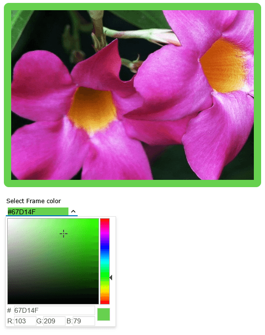
Dropdown List Selection
Present predefined options in compact dropdown components that expand when needed. These controls allow users to select a value without occupying permanent screen space, making them suitable for forms, filters, and configuration panels.
List Box Selection Interfaces
Display selectable items in a scrollable list format where multiple options remain visible. List boxes support clear item selection within a bounded area, which is useful when users need to review and choose from several available options.
Combo Box Selection
Provide a combination of selectable options and quick lookup capabilities within a single component. Users can locate and choose items from a predefined list, supporting efficient selection in scenarios with longer or structured datasets.
Single and Multiple Selection Modes
Allow users to select either one or multiple items from a defined set of options.
Checkbox and Radio Selection Controls
Enable clear and familiar selection patterns using checkbox and radio components. These controls support binary choices or mutually exclusive options.
Grouped Option Presentation
Organize selectable items into logical groups or categories within components. This improves clarity when working with larger option sets and helps users locate and select relevant values more efficiently.
Selection From Predefined Data Sets
Provide selection controls that operate on fixed or predefined collections of values. This ensures consistency in user input and supports scenarios where choices must align with known data structures or application rules.
Selection State Management
Track and manage selected items through component properties and events. This allows applications to respond to user choices, maintain current selections, and update interface behavior based on selected values.
Product Compatibility
Review the details below to ensure this product is supported within your environment.
Component Type
- JavaScript
JavaScript Platform
- React
About jQWidgets
jQWidgets Ltd., founded in 2011 and based in Sofia, Bulgaria, develops user interface components for web and mobile application development. Its products include jQWidgets, a JavaScript and HTML5 UI framework with widgets, themes, data adapters, validation, drag-and-drop features, accessibility support, internationalization, and MVVM capabilities. The company supports developers working with Angular, React, Vue, JavaScript, TypeScript, and jQuery. Its components help teams create responsive, touch-enabled applications for desktop, tablet, and mobile devices.

As official and authorized distributors since 2013, ComponentSource supplies you with legitimate licenses directly from jQWidgets.