Smart UI Selection Controls for React
Configurable React components for flexible and accessible user selection interfaces.
- Implement common selection inputs using configurable React UI components.
- Support accessibility, keyboard navigation, and responsive interaction patterns.
- Adapt selection components with theming, localization, and layout options.

Prices from:
| Available in | |
|---|---|
| Smart UI (Smart HTML Elements) | Loading |
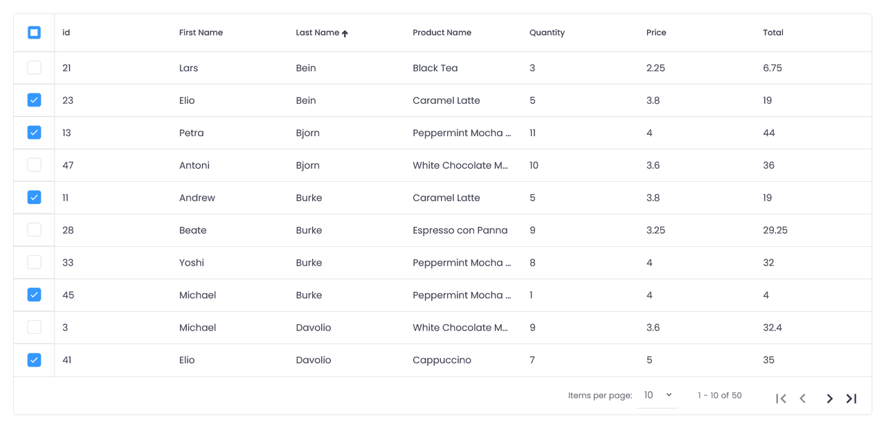
Selection Components
The library includes a range of components for handling user selection scenarios, including dropdown lists, combo boxes, list boxes, checkboxes, radio buttons, and switches.
Dropdown and List Inputs
Components such as DropDownList, ComboBox, and ListBox allow users to select values from predefined data sources.
Toggle and Choice Elements
Checkboxes, radio buttons, switch buttons, and button groups enable users to make selections or toggle states.
Multi-Value Input Support
Certain components support selecting or entering multiple values within a single input field. This is useful for scenarios such as tagging, categorization, or assigning multiple entities.
Filtering and Autocomplete Capabilities
Some selection components provide built-in filtering or autocomplete functionality, helping users quickly locate options within larger datasets.
Keyboard Navigation and Accessibility
The components include support for keyboard interaction and accessibility standards such as WAI-ARIA. This ensures that selection controls remain usable across different input methods and align with accessibility requirements in modern web applications.
Localization and Right-to-Left Support
The library supports localization and right to left layouts, enabling developers to build interfaces that adapt to different languages and regional requirements.
Theming and Visual Customization
Developers can adjust the appearance of selection components through theming and styling options.
Responsive Interaction Design
The components are designed to adapt to different screen sizes and devices, supporting responsive layouts and touch friendly interaction.
Integration Within React Applications
These selection components are built specifically for React, allowing integration into modern front end architectures. They can be used alongside other UI components to construct cohesive and interactive user interfaces.
Product Compatibility
Review the details below to ensure this product is supported within your environment.
Component Type
- JavaScript
JavaScript Platform
- React
About Smart HTML Elements
Smart HTML Elements develops user interface components for responsive websites and mobile applications. The company builds UI components and specializes in platform-independent, mobile-ready presentation layers for developers working across modern web technologies. Its Smart UI suite supports JavaScript, Angular, React, Vue, and Blazor, with components for data grids, schedulers, Gantt charts, Kanban boards, charts, editors, and application layouts. Smart HTML Elements focuses on accessible, customizable, and responsive interface development for web, mobile, and desktop applications.
Learn more about Smart HTML ElementsExplore Smart HTML Elements products

As official and authorized distributors since 2019, ComponentSource supplies you with legitimate licenses directly from Smart HTML Elements.