


官方供應商
我們作為官方授權經銷商,直接提供超過200家開發廠家所發行超過1000個的產品授權給您。
請參閱我們所有的品牌。
繼續用英語閱讀:
Telerik UI for Blazor is a comprehensive UI library that provides over 110 native Blazor components for building modern and feature-rich web applications. This professional-grade solution offers a complete set of components to satisfy all user interface requirements, saving time and effort in UI design.
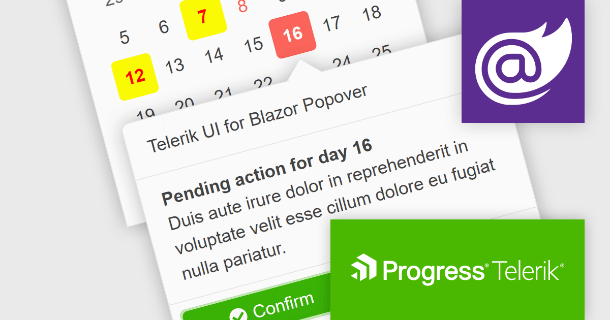
The Telerik UI for Blazor v5.1.0 update (part of the 2024 Q1 release) adds a popover component. More advanced than a tooltip, this component offers a temporary overlay that surfaces contextually relevant information, options or actions upon user interaction (a click or mouse hover) with a designated anchor element. You can set position and collision parameters, as well as customizable parameters for appearance and animations. This provides Blazor developers with a way to offer users additional content without cluttering the primary interface.
To see a full list of what's new in 2024 Q1 (v5.1.0), see our release notes.
Telerik UI for Blazor is licensed per developer and is available as a perpetual license with a one year support subscription, which is available in three tiers: Lite, Priority or Ultimate. See our Telerik UI for Blazor licensing page for full details.
Telerik UI for Blazor is available to buy in the following products:
聯繫電話: (888) 850 9911
傳真: +1 770 250 6199


