Visualice datos financieros complejos con precisión

Julio 10, 2025
Los tipos de gráficos financieros revelan claramente los movimientos del mercado y los patrones de cotización, lo que permite un análisis preciso de acciones, commodities y divisas.

Continuar leyendo en inglés:

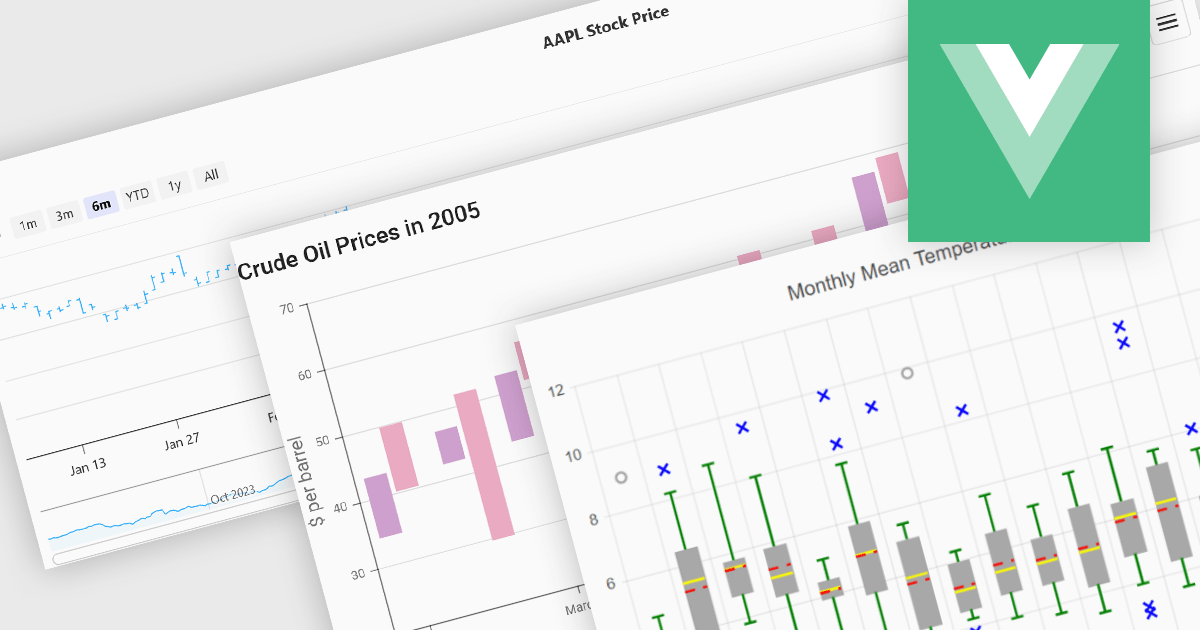
Financial chart components are used within software applications to visually represent complex financial data over time. They enable users, particularly those in trading, investment, and financial analysis, to interpret trends, compare performance, and make data-driven decisions more effectively. These components typically support a variety of chart types tailored to the unique requirements of financial datasets, allowing for granular analysis of price movements, market trends, and volatility.

Common features include:

  • Box Plots highlight statistical distributions and outliers within a data set to aid in risk assessment.
  • Candlestick Charts display opening, closing, high, and low prices over a time period, offering a compact yet detailed view of market behavior.
  • Indicators, such as moving averages or Bollinger Bands, provide additional layers of analysis to support technical trading strategies.
  • Kagi Charts emphasize trend direction by ignoring time intervals, updating only when price movements exceed a threshold.
  • OHLC / HLOC Charts show open-high-low-close values in bar format, helping users spot trend reversals and continuation patterns.
  • Range Charts visualize price ranges rather than individual data points, useful for spotting volatility.
  • Renko Charts filter out minor price movements to reveal clear trend directions.
  • Spline Charts smooth out fluctuations between points, offering a polished view of gradual changes.
  • Step Line Charts present data as discrete intervals, ideal for showing changes at specific points in time.

For an in-depth analysis of features and price, visit our Vue.js Chart components comparison.

Explore Vue.js Financial Charts