


Proveedor oficial
Como distribuidores oficiales y autorizados, le suministramos licencias legítimas directamente de más de 200 editores de software.
Ver todas nuestras marcas.
Continuar leyendo en inglés:
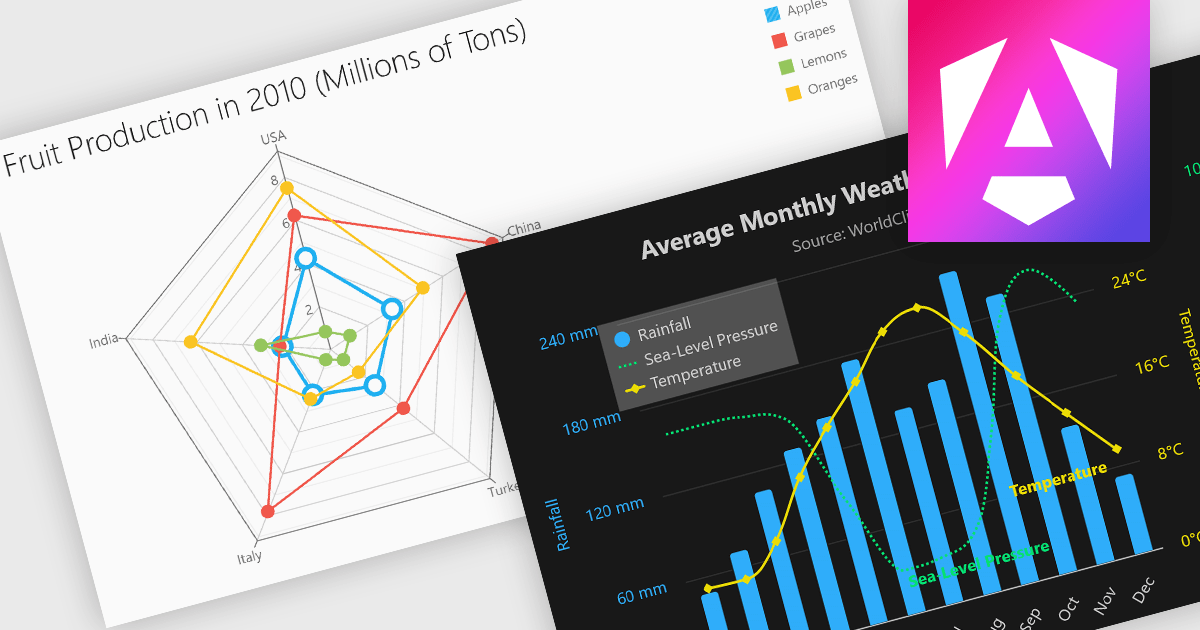
Multi-dimensional and relationship charts allow developers to present complex data structures and inter-variable relationships in a way that’s visually intuitive and analytically powerful. These chart types are essential for exploring correlations, comparing grouped metrics, and visualizing distributions across multiple dimensions. They are commonly used in statistical dashboards, performance analysis tools, and scientific applications where simple line or bar charts aren’t sufficient to capture the full context of the data.
Common charts include:
For an in-depth analysis of features and price, visit our Angular Chart components comparison.
Tel: (888) 850 9911
Fax: +1 770 250 6199


