


Proveedor oficial
Como distribuidores oficiales y autorizados, le suministramos licencias legítimas directamente de más de 200 editores de software.
Ver todas nuestras marcas.
Continuar leyendo en inglés:
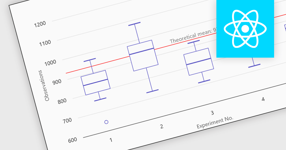
Box plots in React chart controls are statistical visualizations used to present the distribution of a dataset by highlighting key summary values, including the minimum, first quartile (Q1), median, third quartile (Q3), and maximum. In React applications, chart components render this information as a rectangular box representing the interquartile range, with lines known as whiskers extending to the minimum and maximum values, and optional markers indicating outliers. This visualization allows developers and analysts to quickly understand data spread, central tendency, and variability within a dataset. Box plots are commonly used in analytical dashboards, financial analysis tools, and scientific applications built with React, where comparing distributions and identifying anomalies across multiple data groups is important.
Many React chart controls support box plots including:
For an in-depth analysis of features and price, visit our comparison of React chart controls.
Tel: (888) 850 9911
Fax: +1 770 250 6199


