


Proveedor oficial
Como distribuidores oficiales y autorizados, le suministramos licencias legítimas directamente de más de 200 editores de software.
Ver todas nuestras marcas.
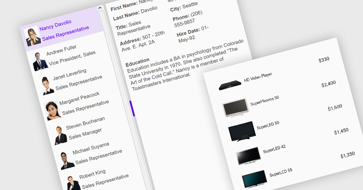
An image listbox is a type of data editor and user interface component that, like the standard listbox, presents a list of selectable items but with the ability to display images alongside or instead of the textual items. By using an associated icon, thumbnail or other graphic for improved visual recognition, this format provides a visual reference for each item, allowing users to browse and select their input more efficiently when the items are more easily identified by appearance than by label. The combination of images with text in a structured, selectable list makes the image listbox valuable in applications that involve data selection, as visually enriched items are well suited in scenarios where users must choose from items that are better identified via imagery (such as product catalogs, avatars, icons, or file previews) rather than by text alone.
Several Angular data editor collections provide image listbox support, including:
For an in-depth analysis of features and price, visit our comparison of Angular data editor components.

For the past two years, ComponentSource has proudly partnered with MDBootstrap to bring high quality UI tools to developers worldwide. Through this partnership, customers gain easy access to MDB’s rich collection of responsive, modern components and templates that help teams build polished and efficient web applications.
Material Design for Bootstrap, widely known as MDB, is a leading front end framework created for developers, by developers. It offers more than five thousand UI components and templates that help teams create visually appealing and fully responsive applications that follow Material Design principles. Trusted by a global community of more than three million developers and designers, and chosen by organizations such as NASA, Amazon, Nike and IKEA, MDB continues to be a reliable and influential tool within the ComponentSource catalog.
The collaboration between ComponentSource and MDBootstrap delivers real benefits to the developer community by combining MDB’s high-quality design tools with ComponentSource’s global reach, licensing expertise, and dedicated customer service. Together, they simplify the adoption of MDB solutions, supporting teams as they build faster and deliver modern, consistent digital experiences. ComponentSource looks forward to the future and to many more years of helping developers create exceptional web applications.
Learn more about MDBootstrap.
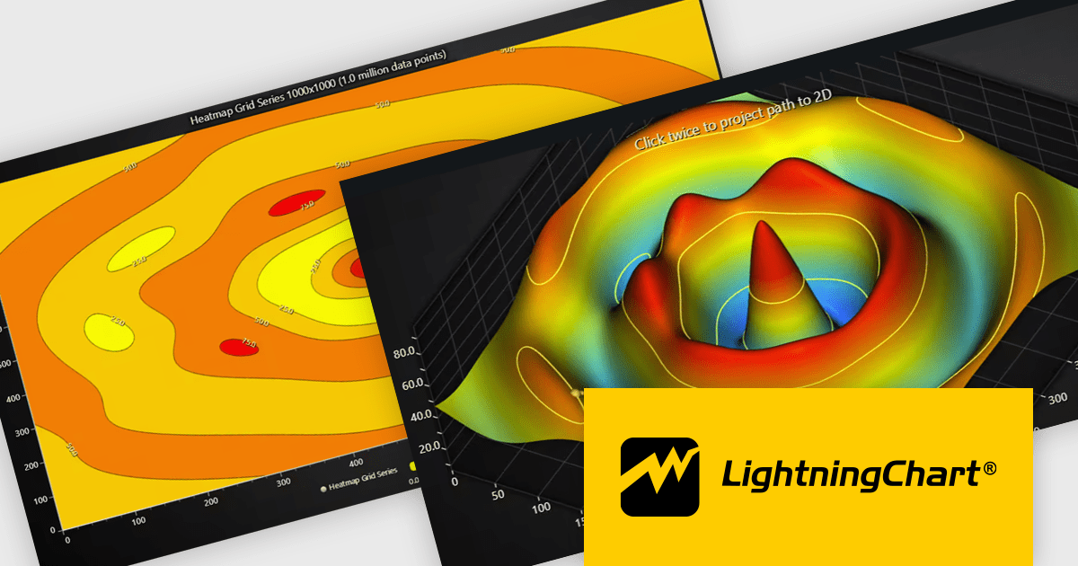
LightningChart JS is a high-performance JavaScript charting library that utilizes WebGL rendering and GPU acceleration to deliver exceptional performance for a wide range of data visualization needs. It is designed to handle large datasets and complex visualizations with ease, enabling developers to create interactive and visually appealing 2D and 3D charts. Ideal for applications demanding smooth real-time data updates, such as financial platforms, engineering tools, scientific research dashboards, and industrial monitoring systems, LightningChart JS provides a comprehensive API for customization and integration into web-based projects.
The LightningChart JS v8.1 update introduces built-in contour rendering for heatmap and surface charts, giving developers a straightforward way to highlight value transitions and gradients within complex datasets. The new contour capabilities automatically generate level lines and labels, while offering control over stroke and text styling for each contour level. This improves the clarity and interpretability of dense numerical data, reduces the need for custom rendering logic, and maintains high performance even when working with detailed datasets.
To see a full list of what's new in v8.1, see our release notes.
LightningChart JS is licensed per developer and is available as an annual license with 1 year support. See our LightningChart JS licensing page for full details.
For more information, see our LightningChart JS product page.
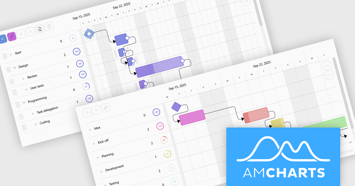
amCharts 5: Gantt is a dedicated JavaScript and TypeScript component for building rich, interactive Gantt charts directly in web applications and dashboards. It is built on the modern amCharts 5 engine and provides everything developers need to visualize project schedules, timelines, and task dependencies using responsive, fast rendering HTML5 graphics. The component supports hierarchical task structures, category grouping, and flexible time scales, which makes it suitable for representing complex projects in a clear, compact, and professional format. With a robust API and straightforward integration in common front end stacks, amCharts 5: Gantt fits naturally into modern web architectures.
amCharts 5: Gantt offers a wide range of capabilities that help teams understand and manage work more effectively, including visual progress indicators, task linking with dependencies, support for milestones and events, and interactive markers for important dates. Charts can be configured as read only monitoring views or as fully interactive planning surfaces where users can drag tasks, adjust timings, update completion, and explore details through tooltips and selection. These strengths make the product an excellent choice for project management systems, resource and workload dashboards, product roadmaps, and visualization tools, wherever organizations need a clear and engaging way to communicate what is happening, what comes next, and how work is progressing.
amCharts 5: Gantt is licensed per developer on an annual or perpetual basis, with options for websites, SaaS and OEM distribution. See our amCharts 5: Gantt licensing page for full details.
For more information, visit our amCharts 5: Gantt product page.
Infragistics Ultimate is a comprehensive development toolkit designed to streamline the creation of high-performance, visually rich applications across multiple platforms. It includes a wide range of user interface (UI) components and development tools for web, desktop, and mobile applications, supporting frameworks such as Angular, React, Blazor, .NET, and more.
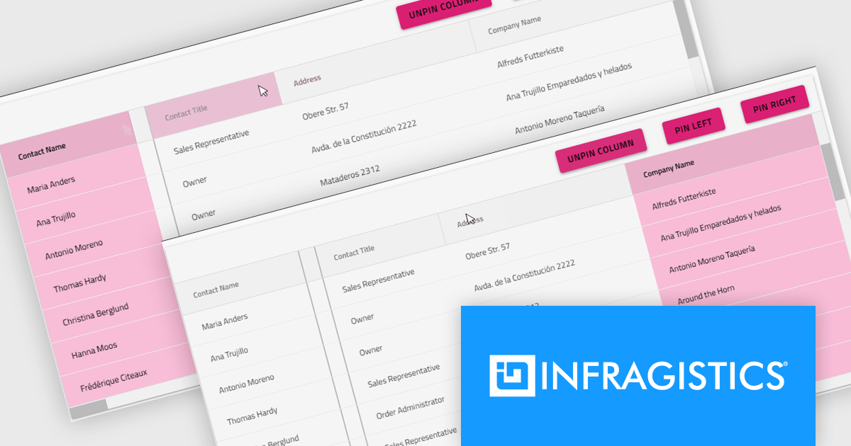
The Infragistics Ultimate 25.2 release includes a feature that lets developers specify individual pinning locations for each grid column, making it possible to fix important data on both the left and right edges of a grid. This added flexibility helps create cleaner, more efficient layouts that keep key information visible at all times. Whether you’re working in Angular, React, Web Components, or Blazor, this capability improves data presentation, simplifies large dataset navigation, and enhances the overall usability of modern web applications.
To see a full list of what's new in version 25.2, see our release notes.
Infragistics Ultimate is licensed per developer and is available as a Perpetual License with a 1, 2 or 3 year support and maintenance subscription. See our Infragistics Ultimate licensing page for full details.
For more information, visit our Infragistics Ultimate product page.
Tel: (888) 850 9911
Fax: +1 770 250 6199


