





Proveedor oficial
Como distribuidores oficiales y autorizados, le suministramos licencias legítimas directamente de más de 200 editores de software.
Ver todas nuestras marcas.
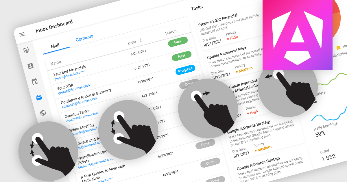
Touch support in a data editor refers to the capability of the software to recognize and respond to touch-based interactions on touchscreen devices. This feature enables users to manipulate and navigate data using gestures such as tapping, swiping, and pinching. Incorporating touch support into data editors enhances the user experience by providing a more intuitive and interactive interface on phones, tablets, and touchscreen monitors.
Many Angular Data Editor collections contain touch support including:
For an in-depth analysis of features and price, visit our comparison of Angular Data Editors.
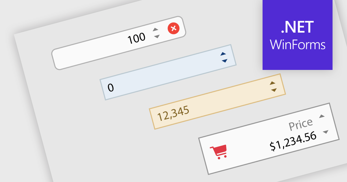
Numeric Spin data editor controls are intended for the efficient and precise input of numerical values. By combining an edit box with up/down spin buttons, users may either type to input directly or utilize the spin buttons to increase or decrease the value. This method promotes faster and less error-prone data entry than manual typing, particularly for large quantities or recurrent value revisions. Many spin editors include built-in validation, range limitations, data type selection, and formatting choices, which further improve data accuracy.
Many .NET WinForms data editor collections contain numeric spin components including:
For an in-depth analysis of features and price, visit our comparison of WinForms data editors.
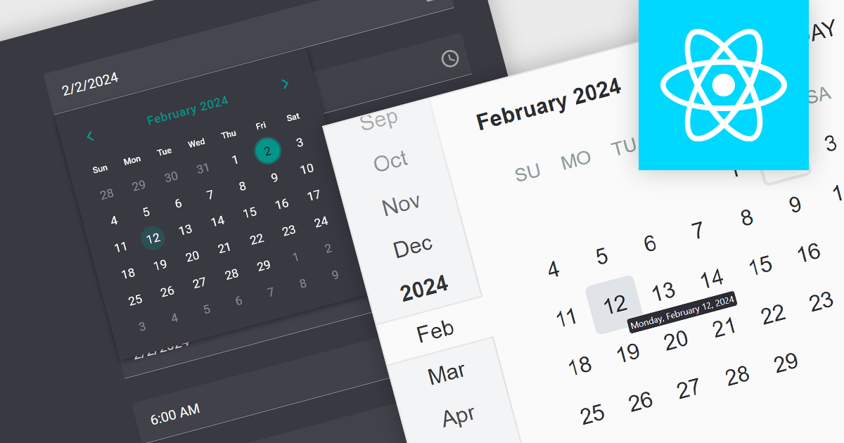
A date editor control is a user interface element designed for selecting and entering dates. It typically combines a text field for manual input with a calendar popup for visual selection. Beyond basic date picking, many controls offer features like time selection, range definition, drop-down lists for pre-defined dates, and even input masks for enforcing specific date formats. Commonly found in applications like forms, booking systems, and calendars, date editor controls streamline date input, improving user experience and data accuracy.
Several React data editor collections provide date editors including:
For an in-depth analysis of features and price, visit our React Data Editors comparison.
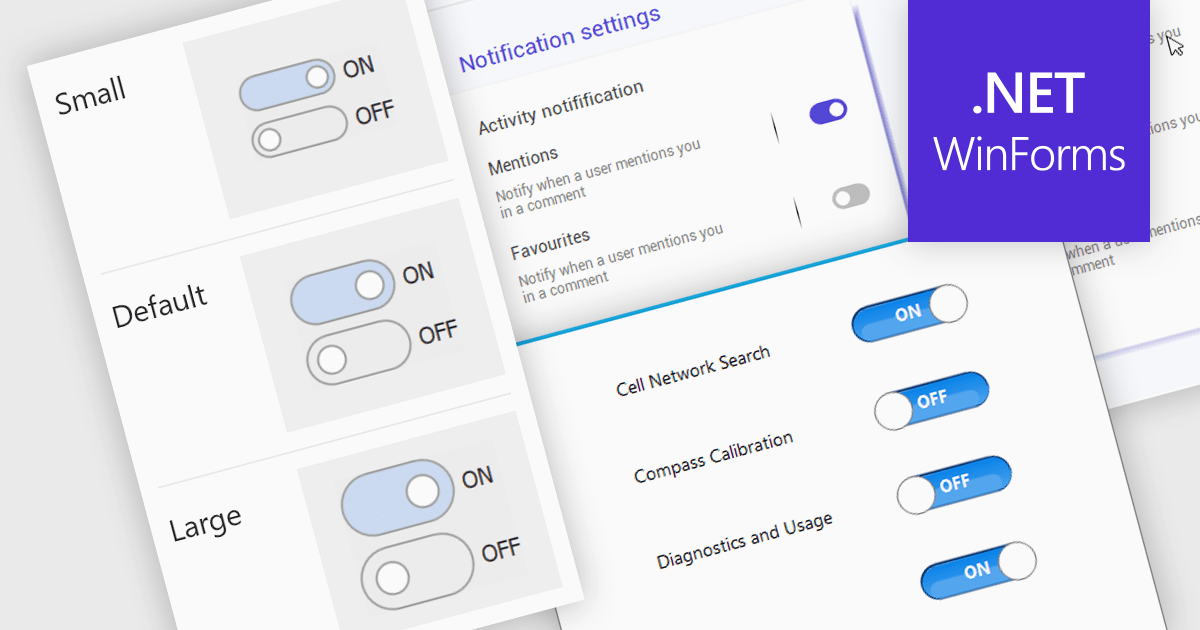
A toggle switch control is a user interface element that allows the rapid, binary (on/off) selection of a setting. It functions like a physical switch, offering a clear visual representation of the chosen state and triggering an immediate change through user interaction. Its simplicity and immediacy make it ideal for controlling settings, activating features, and toggling preferences within digital interfaces.
Several WinForms data editor collections offer toggle switch controls including:
For an in-depth analysis of features and price, visit our comparison of WinForms Data Editors.
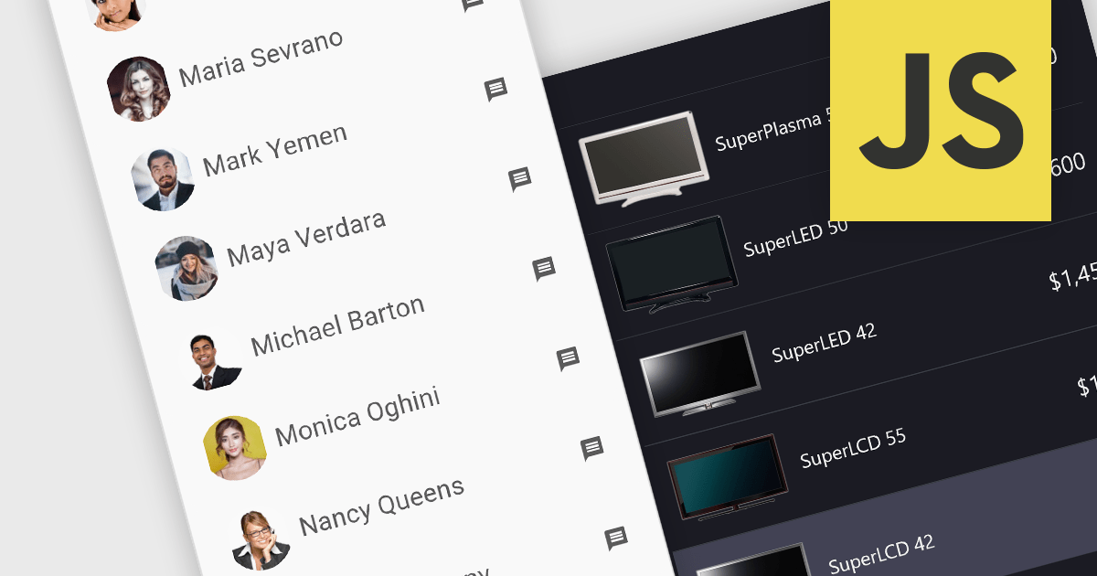
Image listboxes transcend the limitations of traditional listboxes by incorporating image previews alongside textual labels. This creates an intuitive browsing experience, enabling users to quickly identify and select an option with visual cues. This is particularly useful for applications where visual selection enhances the user experience, such as choosing products in an e-commerce platform or selecting avatars in user profiles. It combines the clarity of images with the efficiency of a listbox to streamline selection processes.
Several JavaScript data editor collections provide image listbox capabilities including:
For an in-depth analysis of features and price, visit our comparison of JavaScript Data Editor components.
Tel: (888) 850 9911
Fax: +1 770 250 6199


