


Proveedor oficial
Como distribuidores oficiales y autorizados, le suministramos licencias legítimas directamente de más de 200 editores de software.
Ver todas nuestras marcas.
Layout components in UI suites provide structured systems for arranging and aligning interface elements, giving developers a consistent and efficient way to build user interfaces. By simplifying positioning and handling responsive behavior, they reduce development complexity while ensuring a cohesive design across screens and devices. This leads to faster development, improved maintainability, and a better user experience. Common use cases include creating responsive dashboards, organizing forms, structuring navigation, and building applications that need to adapt across multiple devices.
Several Angular UI suites offer layout components including:
For an in-depth analysis of features and price, visit our Angular UI suites comparison.
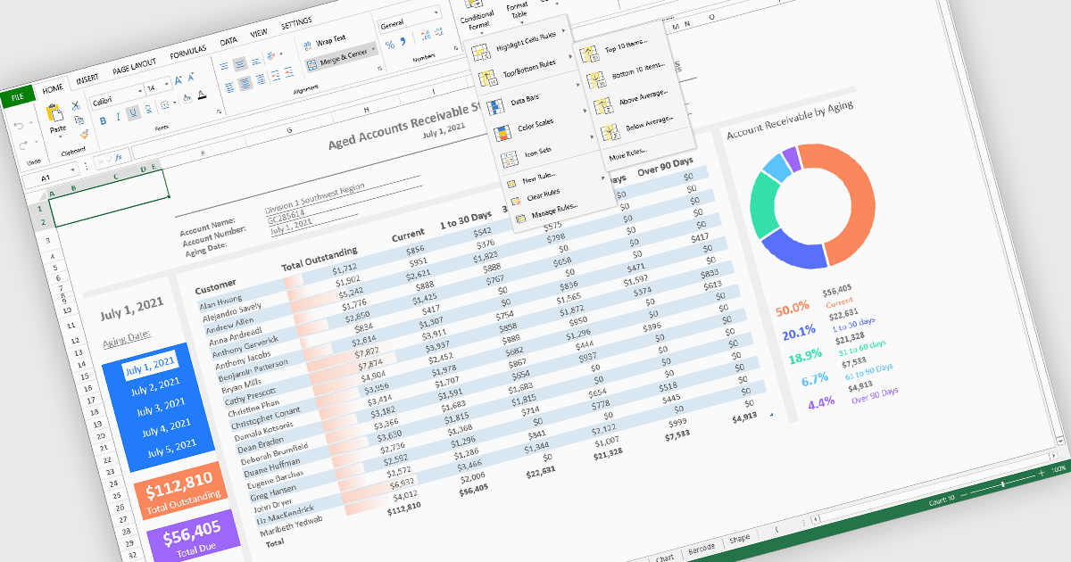
Conditional formatting in spreadsheet components allows developers to dynamically change the appearance of cells based on their values or defined rules. This feature helps highlight important data points, trends, and exceptions without requiring manual updates, making it easier for users to interpret large datasets at a glance. By applying visual cues such as colors, icons, and data bars, conditional formatting enhances readability and supports faster, more informed decision-making within spreadsheet-driven applications.
Several Angular spreadsheet controls offer support for conditional formatting including:
For an in-depth analysis of features and price, visit our Angular spreadsheet controls comparison.
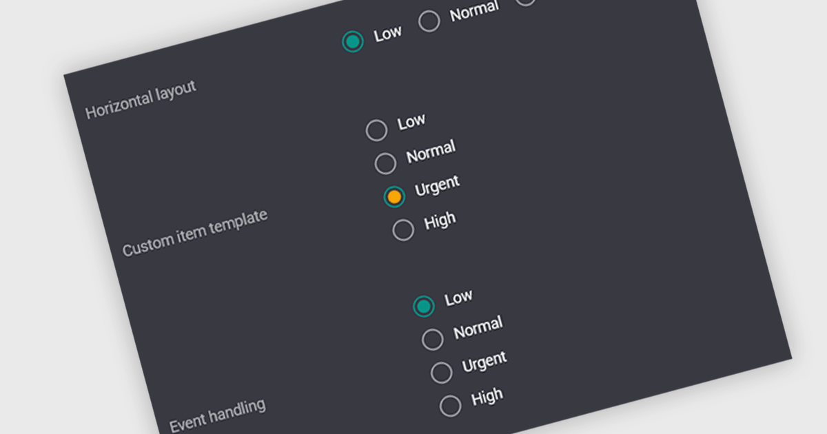
A radio group is a user interface element that presents a set of predefined options where only one value can be selected at a time for a particular field. It allows users to choose a single state, category, or configuration directly within the editing interface, with the selected option mapped to the underlying data value. This approach improves data consistency by preventing invalid combinations, simplifies validation logic by constraining input to known values, and accelerates data entry by replacing manual text input with clear, clickable choices that reduce ambiguity and input errors.
Several Vue.js data editor collections include radio group functionality, including:
For an in-depth analysis of features and price, visit our comparison of Vue.js data editor collections.

ComponentSource and Optimajet have built a strong partnership focused on helping developers create, manage, and render complex web forms. OptimaJet provides flexible, developer-friendly components designed to simplify business process management, enabling teams to build scalable, efficient applications while reducing development time and cost.
At the core of their offering is Optimajet FormEngine, which helps developers to rapidly design dynamic, customizable forms with minimal effort. It supports complex logic and data handling, and provides the flexibility needed to adapt forms to specific business requirements across a wide range of industries.
This collaboration enables ComponentSource to further differentiate its product portfolio by offering advanced form-building solutions that meet modern development demands. By distributing OptimaJet’s products globally, ComponentSource ensures developers worldwide can easily access, evaluate, and implement these tools, strengthening its position as a trusted source for high-quality development components.
Learn more about Optimajet.
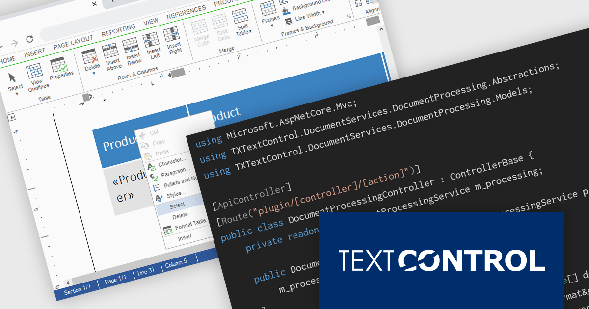
TX Text Control DS Server is a server-side document processing solution designed to integrate document generation, editing, and conversion capabilities into modern applications. Built for web, cloud, and service-based environments, it enables developers to programmatically create and manipulate rich-text documents such as DOCX, PDF, and HTML within their own systems. With APIs designed for integration into .NET applications and other backend services, it supports scenarios such as automated document generation, template-based reporting, and document workflows. By providing high-fidelity rendering and robust document processing on the server, it helps development teams incorporate powerful document functionality into enterprise applications without relying on client-side tools.
The DS Server 5.0 update introduces new Dependency Injection services for plugins, making it easier for developers to extend and integrate DS Server within enterprise applications. Using ASP.NET Core Dependency Injection, plugins can now access internal DS Server functionality through two new services. The IDocumentProcessingService provides programmatic access to document processing capabilities such as document conversion, mail merge processing, document manipulation, PDF form field extraction, and barcode generation. In addition, the IDocumentEditorSessionService enables plugins to interact with active Document Editor sessions, allowing developers to access and modify live documents, work with form fields, adjust formatting, or implement custom logic tied to editor activity. Together, these services provide a flexible way to build powerful extensions and integrate DS Server into complex systems and backend services.
To see a full list of what's new in version 5.0, see our release notes.
Text Control DS Server is licensed per server and is available as an Annual License that includes software updates. See our Text Control DS Server licensing page for full details.
For more information, visit our Text Control DS Server product page.
Tel: (888) 850 9911
Fax: +1 770 250 6199


