


Fournisseur officiel
Comme nous somme les distributeurs officiels et autorisés, nous vous fournissons des licences légitimes directement à partir de 200+ éditeurs de logiciels.
Voyez toutes nos marques.
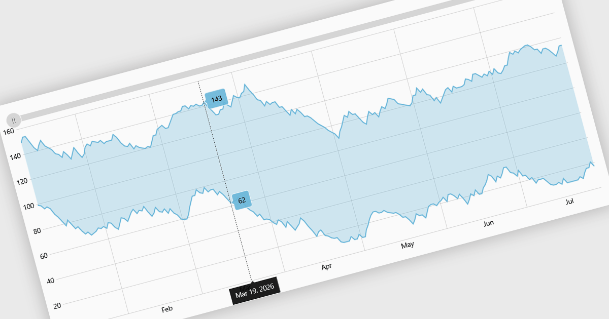
Range charts visualize financial data based on fixed price movements rather than time intervals, grouping activity into consistent ranges to highlight meaningful price action. By filtering out minor fluctuations and market noise, they make trends, volatility, support, and resistance levels easier to identify, especially in fast-moving or irregular markets. Common use cases include technical analysis for trading platforms, monitoring price volatility in equities or cryptocurrencies, and analyzing high-frequency financial data where understanding true market behavior is more important than tracking time-based changes.
Several React charting components provide you with range charts, including:
For an in-depth analysis of features and price, visit our React chart controls comparison.
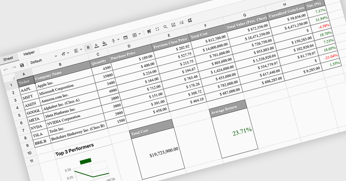
Formula and function support in spreadsheets enables users to perform mathematical, statistical, financial, and logical calculations directly within cells, transforming raw data into meaningful results. By automating calculations and ensuring consistent logic across datasets, this capability improves accuracy, saves time, and supports real-time updates as data changes. It allows users to analyze trends, validate data, and model scenarios without relying on external tools. Common use cases include financial forecasting, budgeting, statistical analysis, performance reporting, and operational planning, making spreadsheets a powerful and flexible platform for data-driven decision-making across business, finance, and technical teams.
Several Vue spreadsheet controls offer formula and function support including:
For an in-depth analysis of features and price, visit our Vue spreadsheet controls comparison.
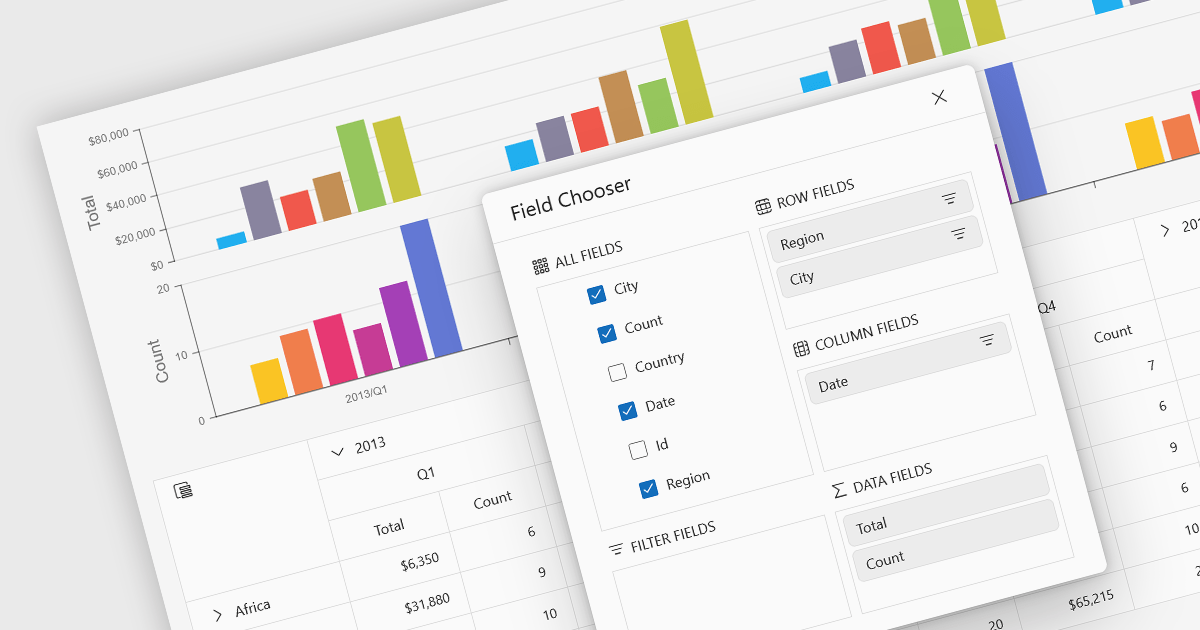
A pivot chart is a dynamic data visualization tool that works in conjunction with a pivot table to present summarized data in a graphical format. It allows users to interactively explore and analyze large datasets by adjusting dimensions such as categories, series, and filters without modifying the underlying data. By visually representing trends, comparisons, and patterns, pivot charts help users make data-driven decisions more efficiently. They are especially useful in business intelligence and reporting scenarios where clarity and flexibility in viewing aggregated data are essential.
Several JavaScript UI suites provide you with pivot chart functionality, including:
For an in-depth analysis of features and price, visit our comparison of UI suites.
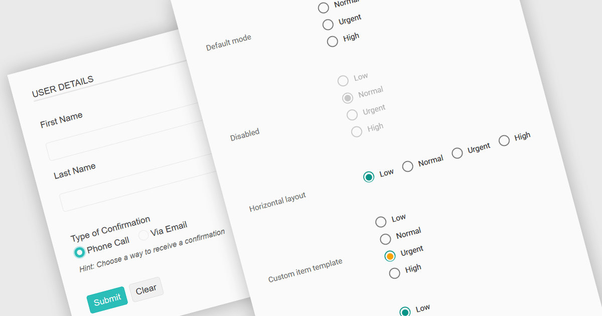
A radio group in data editing refers to a set of mutually exclusive options presented as selectable buttons, where only one option can be active at a time. It is typically used in user interfaces to enforce a single selection from a predefined set of values, which helps reduce input errors and ensures data consistency. By visually grouping related choices and clearly indicating the selected value, a radio group simplifies decision-making for users and speeds up data entry. This control is especially useful in forms and configuration settings where a user must choose one valid option from several possibilities.
Several JavaScript data editor collections provide support for radio groups, including:
For an in-depth analysis of features and price, visit our comparison of JavaScript data editors.

SpreadJS is a JavaScript spreadsheet and data visualization component built to deliver Excel-compatible functionality within web applications. It provides a flexible, high-performance interface for displaying and manipulating tabular data, supporting advanced features such as formulas, pivot tables, charts, conditional formatting, and data binding. SpreadJS integrates smoothly with popular frameworks like React, Angular, and Vue, and includes robust import and export capabilities for Microsoft Excel files. It is commonly used in enterprise applications where users need a responsive, interactive spreadsheet experience directly in the browser.
The SpreadJS 19.0.0 update introduces a new Collaboration Server Add‑on that enables real‑time, multi‑user editing of the same spreadsheet within web applications by integrating the collaboration framework and server infrastructure directly into SpreadJS. This add‑on lets developers build functionality where multiple clients see and apply changes instantly to workbook data with consistent state across users, supports conflict‑free concurrent edits using Operational Transformation logic, and includes features such as live user presence and permission controls.
To see a full list of what's new in 19.0.0, see our release notes.
SpreadJS is licensed per developer and includes 1 Year Maintenance (major and minor version releases and unlimited support phone calls). SpreadJS requires an Annual or Perpetual Deployment License. The optional Add-ons are available at an additional cost, and require a SpreadJS license. See our SpreadJS licensing page for full details.
For more information, visit our SpreadJS product page.


Tél : (888) 850 9911
Fax : +1 770 250 6199


