


Fournisseur officiel
Comme nous somme les distributeurs officiels et autorisés, nous vous fournissons des licences légitimes directement à partir de 200+ éditeurs de logiciels.
Voyez toutes nos marques.
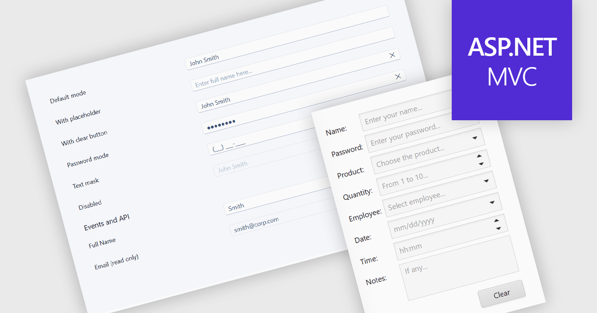
Text box components are user interface controls that allow users to enter and edit text within an application. They are commonly used for tasks such as data entry, search, and form completion, and often provide features including validation, formatting, placeholder text, and accessibility support. By helping developers create consistent user experiences, improve data quality, and reduce implementation effort through reusable functionality, text box components are a fundamental part of modern web and desktop applications.
Several ASP.NET MVC data editor collections provide a text box component, including:
For an in-depth analysis of features and price, visit our comparison of ASP.NET MVC data editor collections.
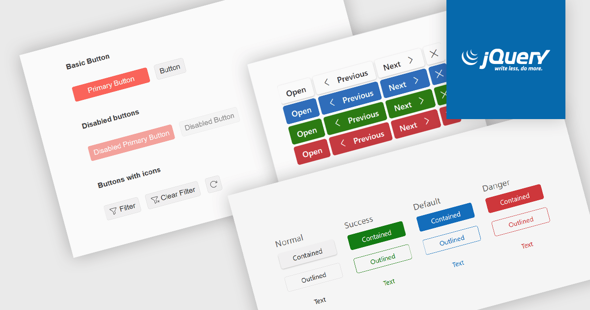
Button editors are user interface (UI) components that enable users to initiate actions within an application, such as submitting data, opening dialogs, clearing input, or executing custom commands. Modern button components often provide options for customizing appearance, icons, size, placement, and behavior, helping developers create consistent, accessible interfaces while supporting application-specific workflows and improving the overall user experience.
Several jQuery data editor collections provide you with button editor controls, including:
For an in-depth analysis of features and price, visit our comparison of jQuery data editors.
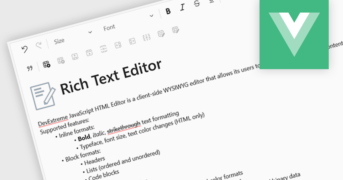
An RTF (Rich Text Format) Editor is a user interface component for Vue.js applications that provides a visual, word processor-style editing experience, allowing users to create and edit formatted content such as bold and italic text, headings, lists, tables, links, images, and other rich content without writing HTML directly. It typically outputs HTML or another structured format for storage and display, while integrating with Vue.js data binding and application state. For software developers, an RTF editor component reduces the effort required to implement advanced text editing features, offers a consistent editing experience across applications, supports extensibility through plugins and customization, and helps accelerate development of content management systems, documentation platforms, messaging applications, and other software that requires user-generated formatted content.
Several Vue.js data editor collections include rich text editing, including:
For an in-depth analysis of features and price, visit our comparison of Vue.js data editor collections.
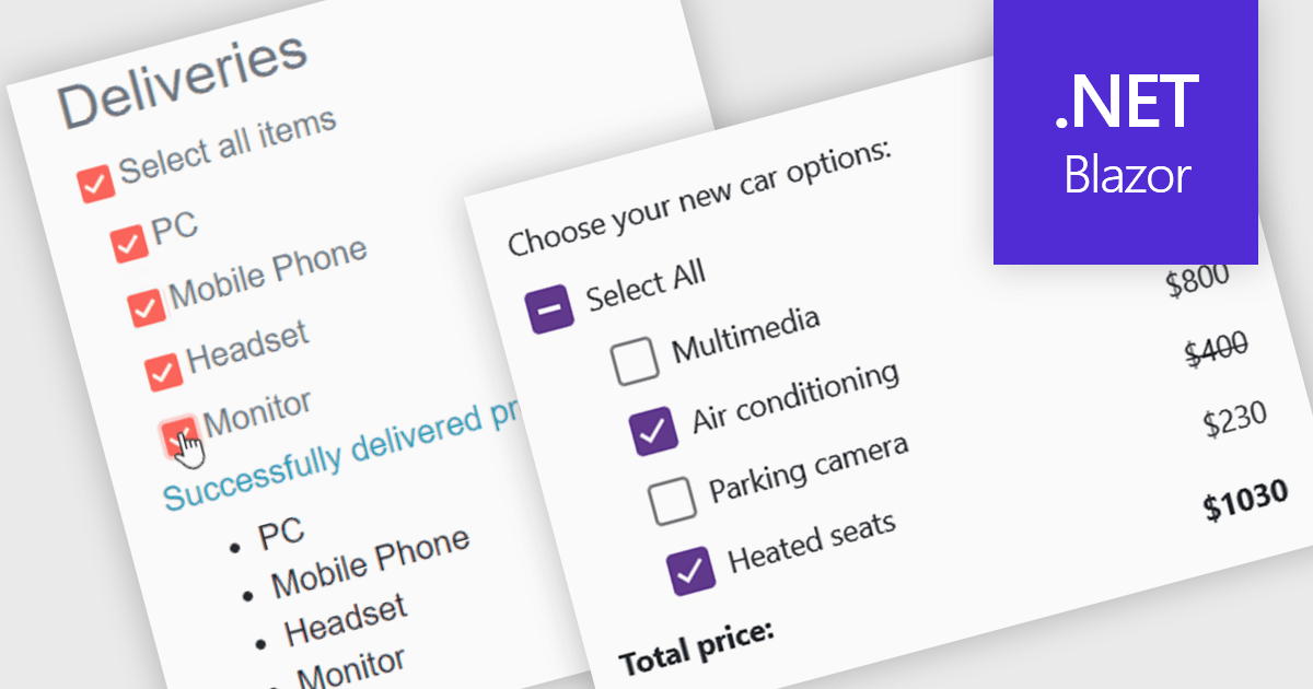
A checkbox data editor is a user interface element that enables users to view and modify Boolean values within forms, data grids, or other data-bound components. It provides an intuitive way to represent true/false, enabled/disabled, or selected/unselected states while maintaining synchronization between the user interface and the underlying data model. For developers, checkbox data editors simplify data entry and validation, improve usability by presenting state-based values in a familiar format, reduce input errors compared to manual text entry, and integrate with Blazor’s data binding and event-handling capabilities to support responsive, maintainable applications.
Several .NET Blazor data editor collections contain checkbox editors including:
For an in-depth analysis of features and price, visit our comparison of .NET Blazor data editors.
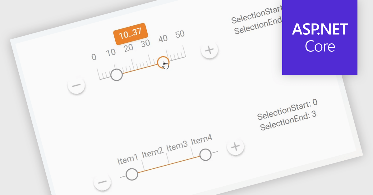
A Range Trackbar in ASP.NET Core Data Editor controls is an interactive input component that lets users select a numeric range by moving two handles along a track, rather than typing minimum and maximum values into separate fields. This makes range-based data entry faster, clearer, and less error-prone, especially when the valid values are bounded, such as prices, dates, percentages, ratings, quantities, or performance thresholds. For developers, it provides a more intuitive way to capture structured range input while maintaining control over validation, step intervals, formatting, and default values. In real-world applications, a Range Trackbar can be used in product filters to select a price range, reporting dashboards to define a date or score interval, booking systems to choose acceptable time windows, analytics tools to adjust threshold limits, or administrative forms where users need to configure minimum and maximum values without manually entering exact numbers.
Many ASP.NET Core Assembly Data Editors collections contain Range Trackbar controls including:
For an in-depth analysis of features and price, visit our comparison of ASP.NET Core Assembly Data Editors.


Tél : (888) 850 9911
Fax : +1 770 250 6199


