


Fournisseur officiel
Comme nous somme les distributeurs officiels et autorisés, nous vous fournissons des licences légitimes directement à partir de 200+ éditeurs de logiciels.
Voyez toutes nos marques.
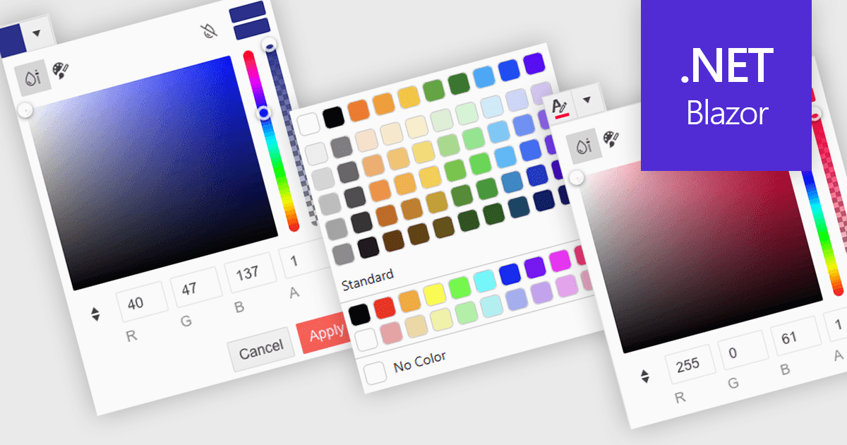
A color picker is a user interface element that allows users to choose and apply colors to specific parts of their data without writing any code. It typically appears as a small palette or input box that, when clicked, opens a panel with color options like swatches, sliders, or hex code fields. This feature supports intuitive visual customization, enabling users to highlight patterns, mark important values, or align with corporate color schemes. In advanced editors, color pickers also support themes or accessibility settings, such as high-contrast palettes.
Several .NET Blazor data editors can provide you with a color picker, including:
For an in-depth analysis of features and price, visit our .NET Blazor data editors comparison.
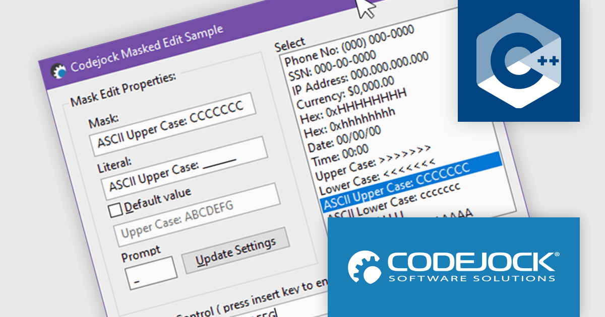
Codejock Toolkit Pro is a comprehensive suite of UI components designed to enhance the development process and create visually appealing, feature-rich applications. The toolkit offers a wide range of controls, including calendars, charts, docking windows and more, each meticulously crafted to provide exceptional performance and customization options. With features like data binding, theming and localization, developers can easily integrate the toolkit into their projects and tailor the interface to meet specific requirements. The toolkit's versatility makes it suitable for various applications, from desktop software to web-based solutions, empowering developers to deliver professional-grade user experiences.
In the Codejock Toolkit Pro 24.2.0 release, the MaskEdit control has been updated to offer expanded support for ASCII characters, allowing for broader and more accurate input validation. Developers can now take advantage of new automatic case conversion options to enforce lowercase or uppercase input without additional scripting. The inclusion of two new modes further improves control over hexadecimal and alphanumeric inputs, making the control more versatile for form fields, serial input, and other structured data entry scenarios.
To see a full list of what's new in the 24.2.0 release, see our release notes.
Codejock Toolkit Pro is licensed per developer and is available as a perpetual license with 30 days or 1 year subscription (product updates and phone/email technical support). See our Codejock Toolkit Pro licensing page for full details.
For more information, visit our Codejock Toolkit Pro product page.
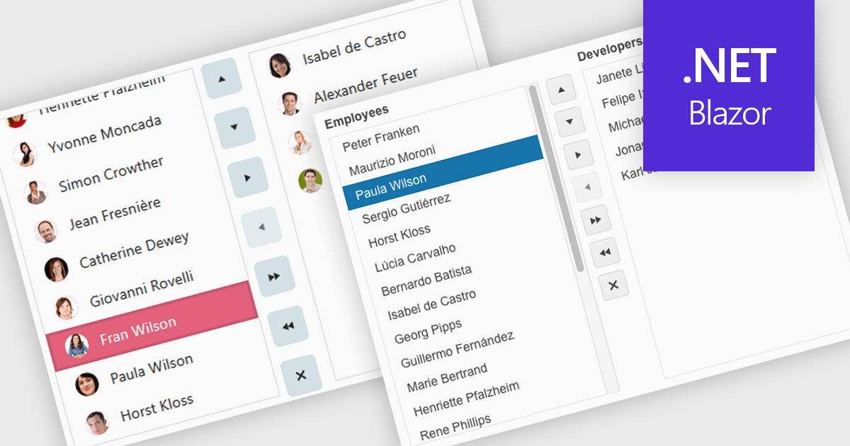
Listboxes are interactive controls that present users with a scrollable list of predefined options, allowing single or multiple selections without manual entry. By constraining inputs to valid choices and offering keyboard navigation, real-time filtering, and drag-and-drop reordering, they reduce errors and help maintain data integrity. Additionally, customizable templates let developers incorporate icons, colors, or detailed item descriptions, making complex data sets easier to scan. Overall, listboxes offer a compact, intuitive interface that balances flexibility with consistency, boosting productivity wherever structured data selection is needed.
Several .NET Blazor data editor collections can provide you with a listbox including:
For an in-depth analysis of features and price, visit our .NET Blazor data editors comparison.
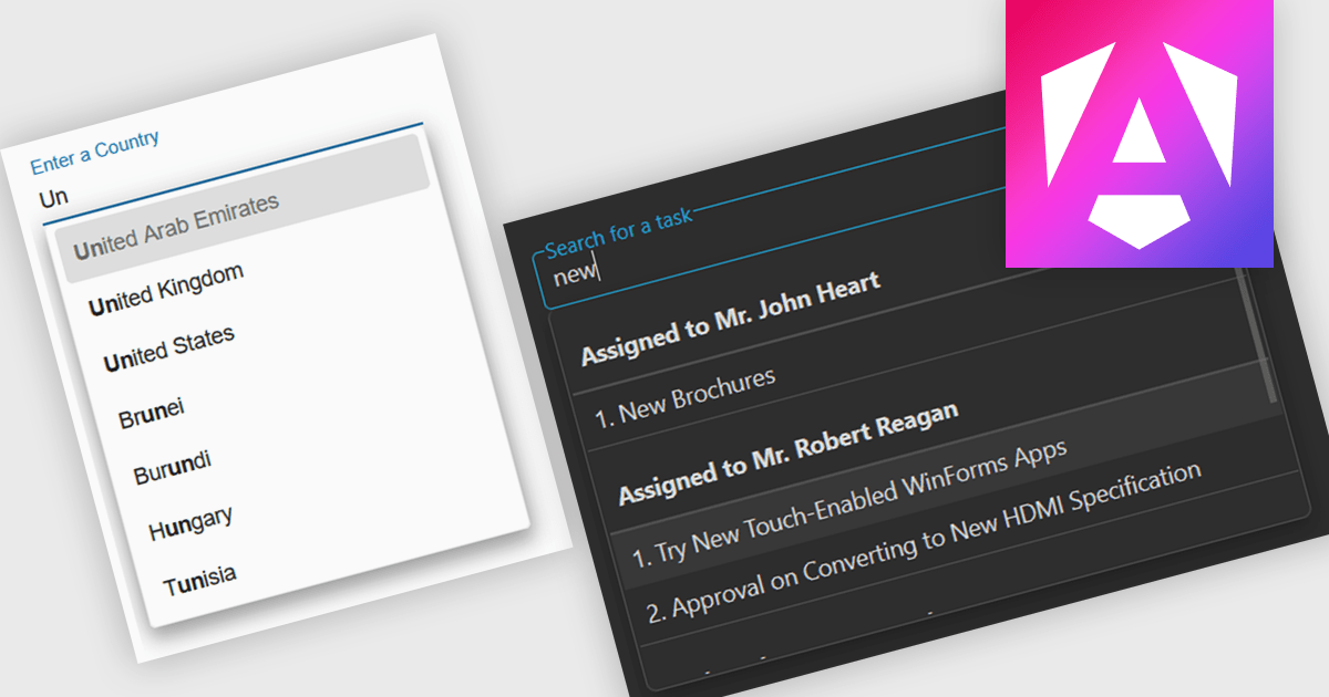
Autocomplete is a feature that dynamically suggests valid inputs as the user types, based on the current context or previously entered values. It enhances productivity by reducing the amount of typing needed and helps prevent errors or invalid entries by guiding users towards acceptable inputs. Ultimately, it enhances the overall user experience by making interfaces more intuitive and efficient for both technical and non-technical users.
Several Angular data editor collections include autocomplete features, such as:
For an in-depth analysis of features and price, visit our comparison of Angular data editor collections.
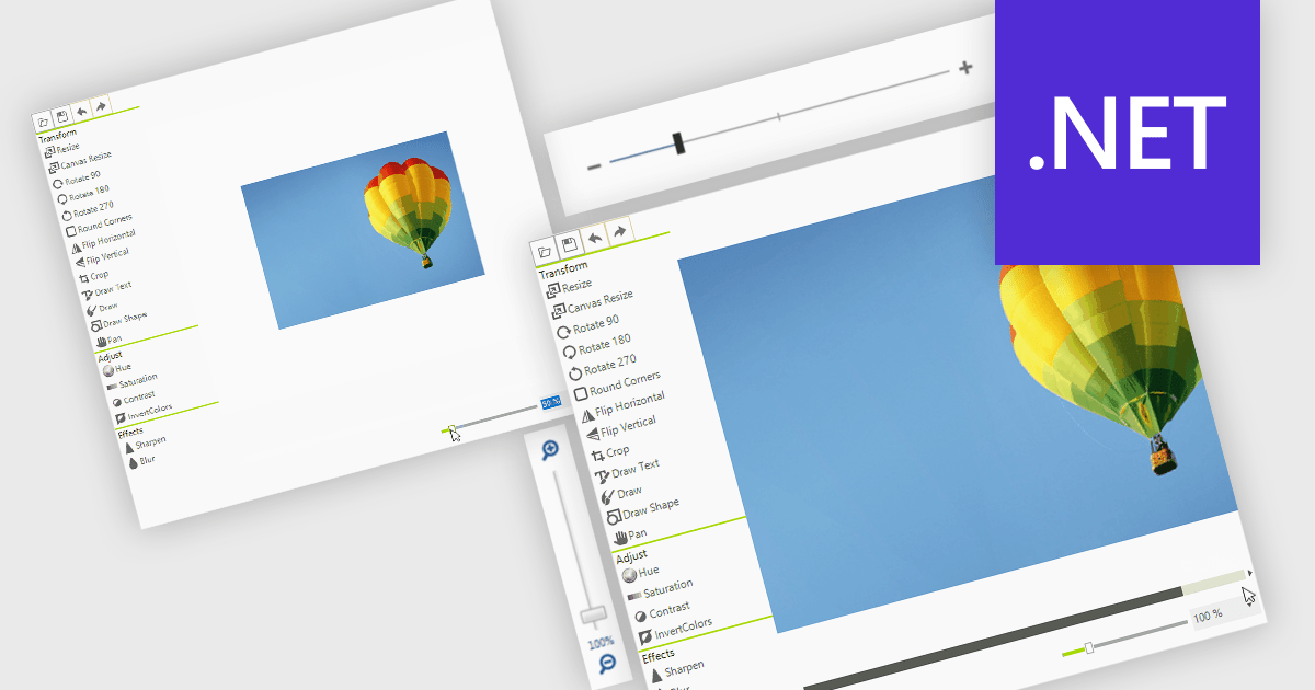
A zoom trackbar in a user interface (UI) is a visual control element that allows users to dynamically adjust the zoom level of content or a display area. They are typically represented as a slider, a linear bar with a draggable thumb, which can be oriented both horizontally or vertically. It provides real-time visual feedback and fine-grained control and is a quick and intuitive way to scale content such as images, documents, or data visualizations without relying on keyboard shortcuts or complex menus. This makes it a valuable feature in applications that handle large or complex visual data, where users need to alternate quickly between detailed inspection and broader overviews, such as graphic design tools, map interfaces, and analytical dashboards.
Several data editor collections for .NET provide zoom trackbars, including:
For an in-depth analysis of features and price, visit our comparison of .NET data editor collections.


Tél : (888) 850 9911
Fax : +1 770 250 6199


